One cannot think well, love well, sleep well, if one has not dined well.
― Virginia Woolf, A Room of One's Own
After several successful launches in a variety of consumer-facing industries, Askeladden & Co is moving into food, developing a one-stop-takeaway shop with a few sit-down options, for hungry, quality-oriented urban consumers of all ages.
Category→
Food & beverages
Work→
Strategy, naming, visual identity
Awards→
TBA
Client→
Askeladden & Co
Background
The industry is fragmented, with inefficient business models and few strong restaurant brands, making it suited for Food Society’s approach of digitising and streamlining both production, distribution and customer experiences.
The project’s design challenge was to create a brand and visual identity that stands out in the market, cementing the company’s unique value propositions.
Concept
The world of kitchens is big, exciting and varied. Where most chefs specialise in one, the team at Food Society sees the world as their playground, exploring tastes from all over the world. Food Society also believes that food is best enjoyed at home or wherever you happen to be when you crave something good. Alone or with friends. And the selection should be limited to the best meals, elimination the nonsense of huge menus.
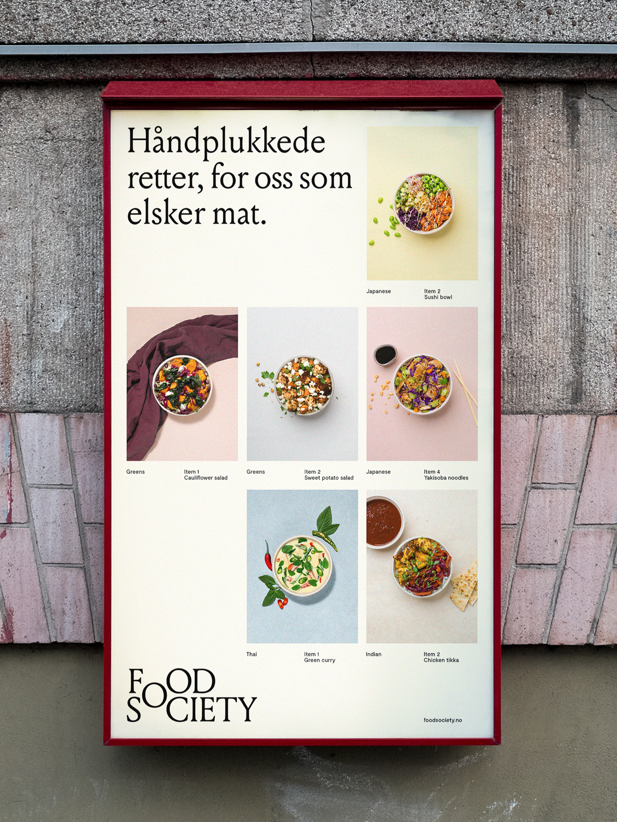
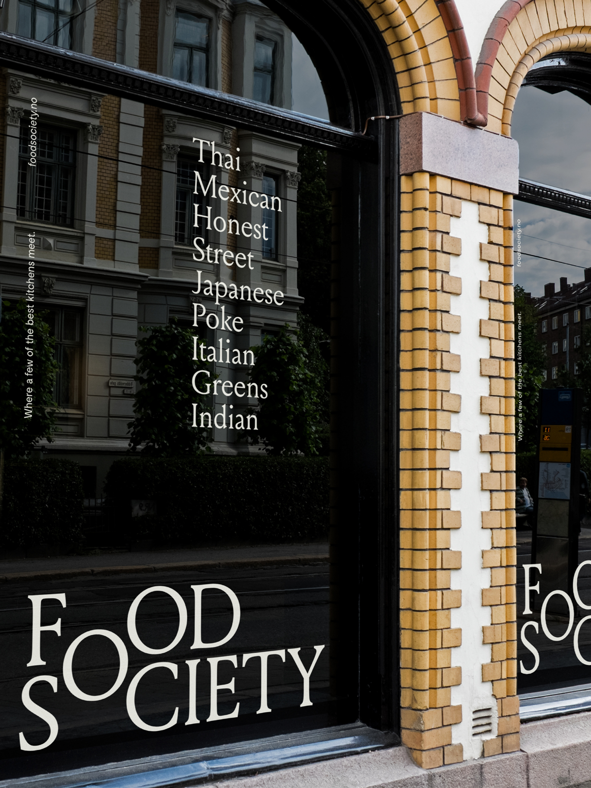
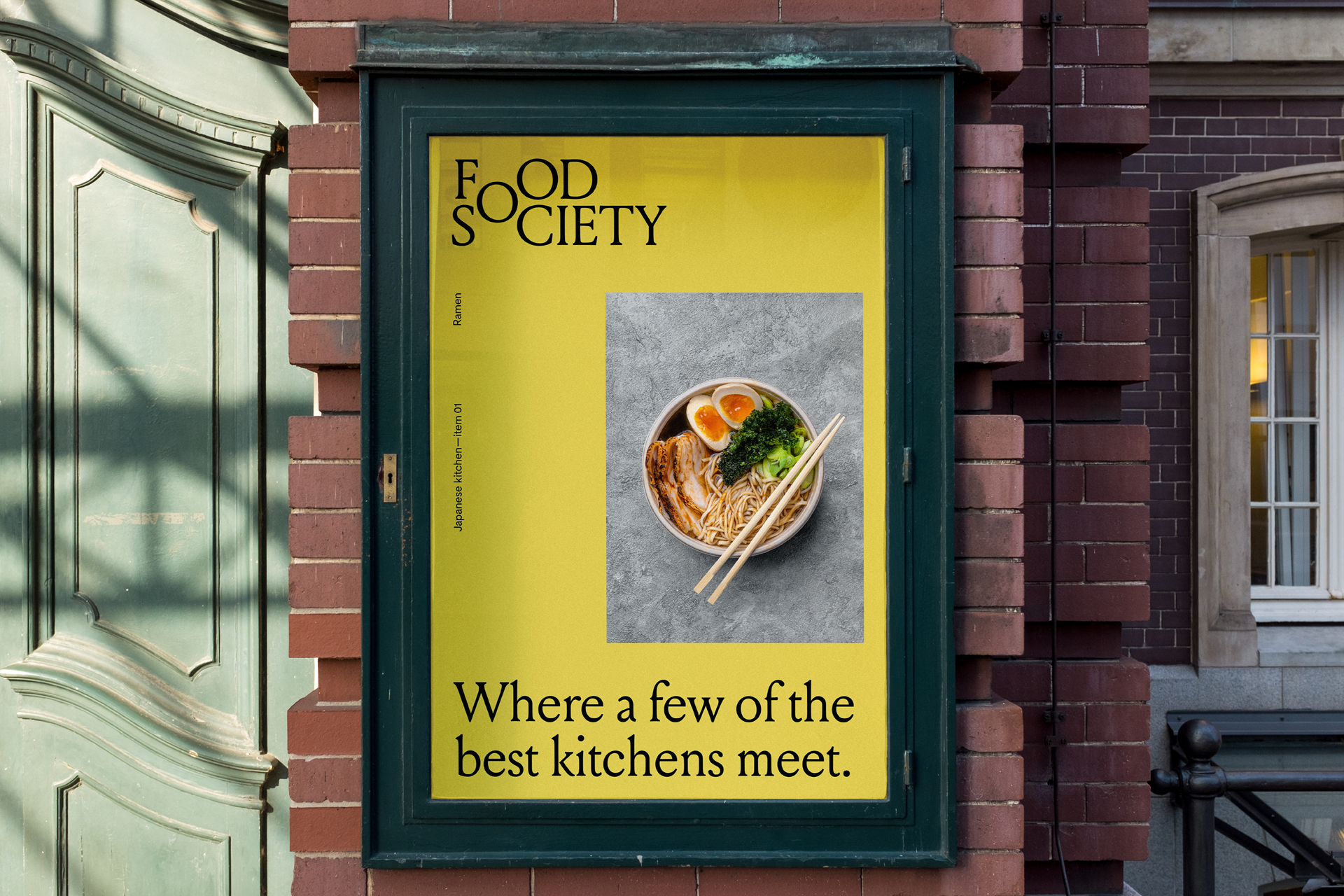
The result? Norway’s only “dine-in-first” restaurant concept, where a few of the best kitchens meet to reach a common goal: Giving hungry Oslovians the best dine-in food experience possible.
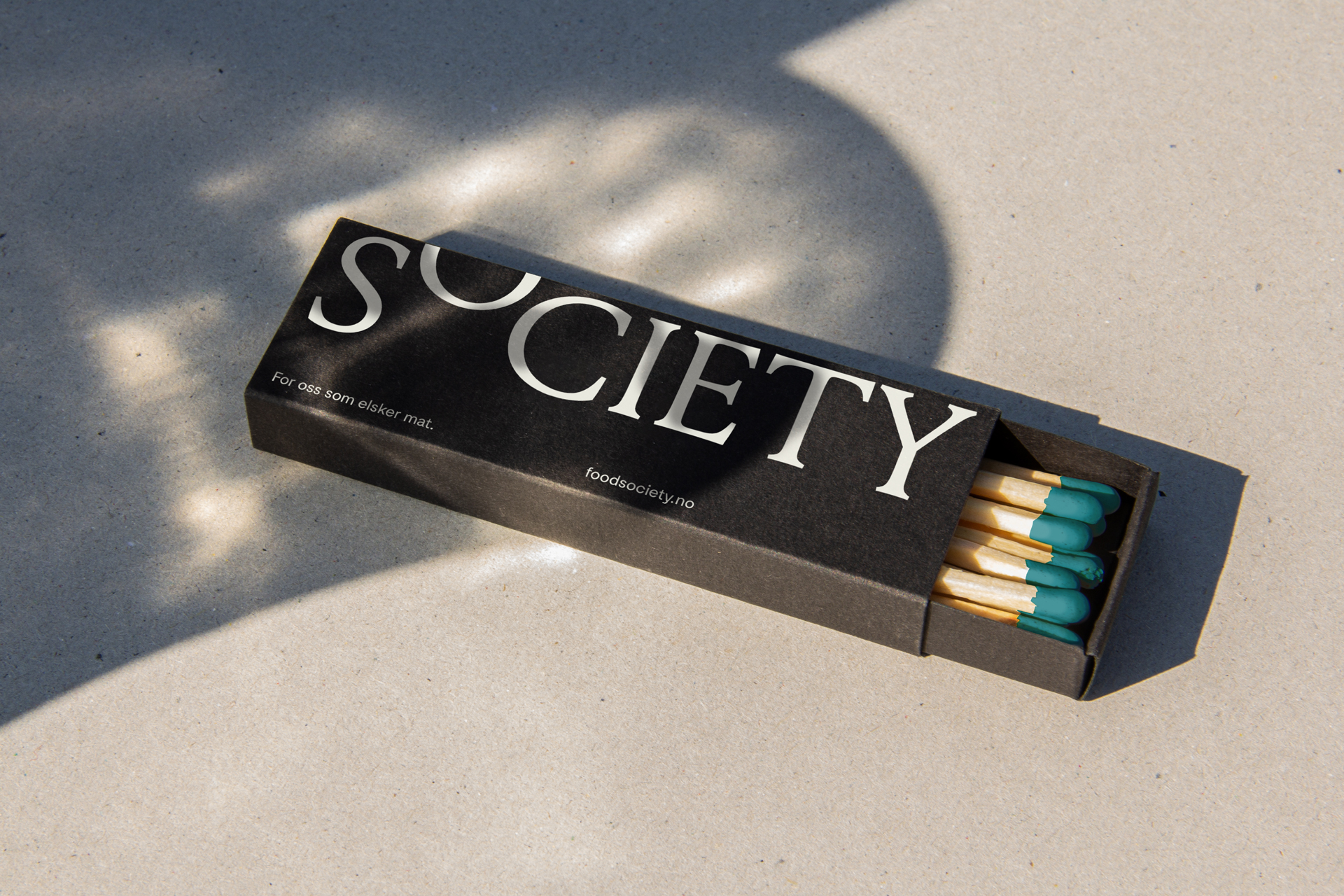
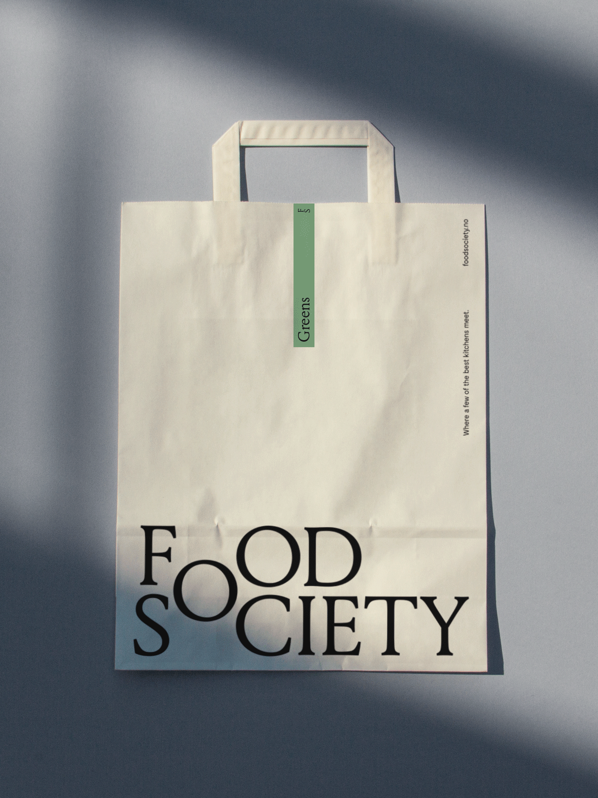
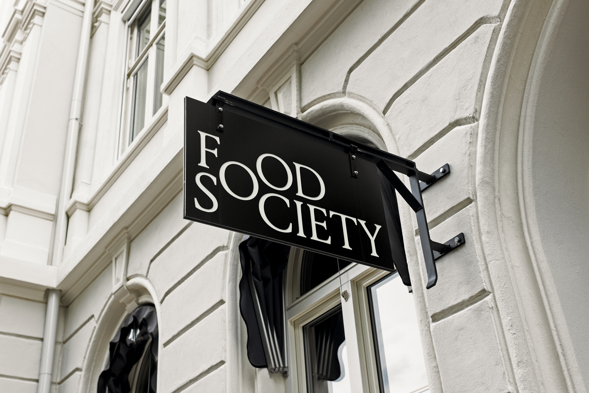
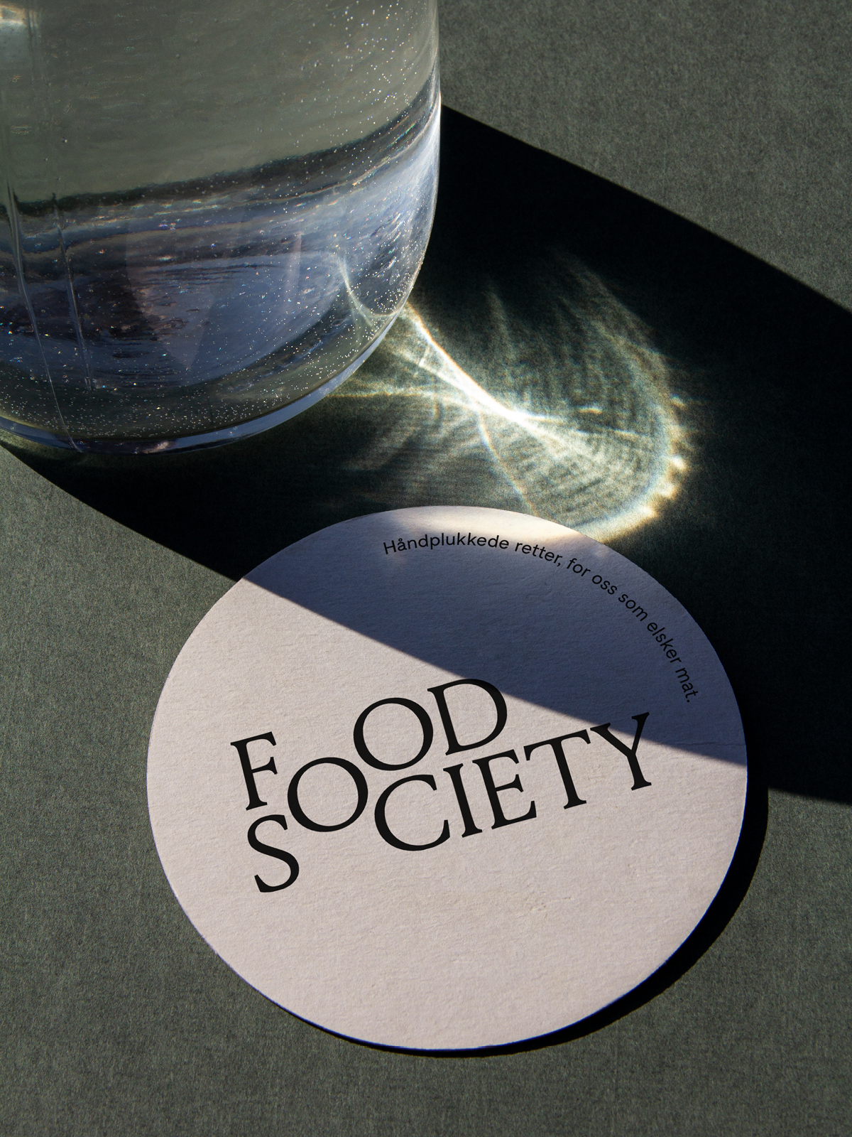
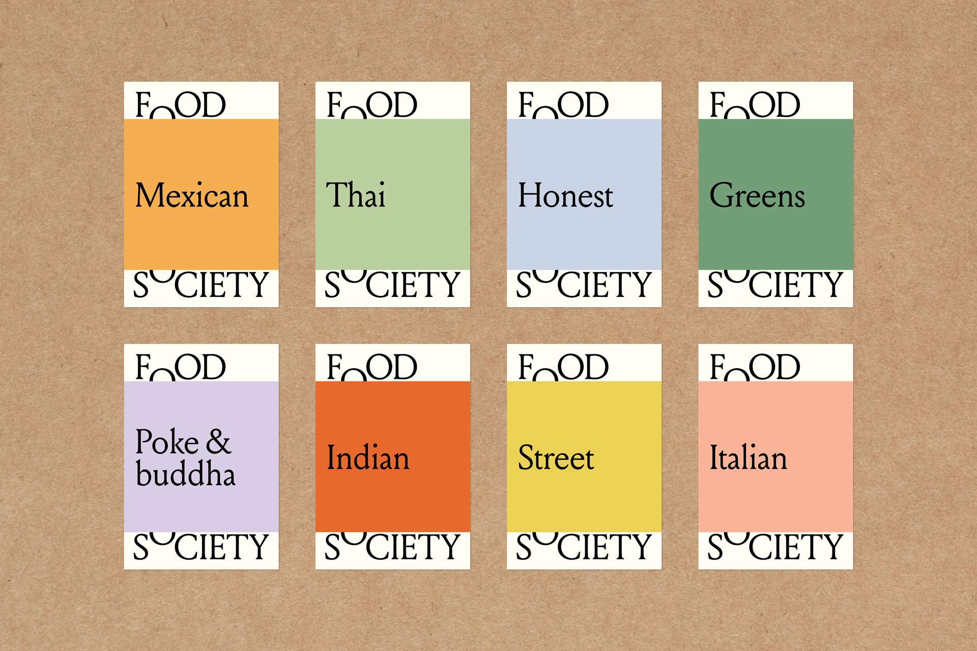
The Food Society logo embodies the idea of community. The collective ‘O’ represents the shared point where the different kitchens come together under one roof. As the focal point of the identity, it becomes a visual gesture that can be leveraged in varied ways in order to build visual recognition.
We are absolutely thrilled with the outcome of the Food Society brand. Food Society gives a premium and high-end feeling, without excluding any potential customers. We are also really happy with how Bleed has managed to incorporate the different cuisines we offer, while still managing to keep them all under one umbrella. The design system is smart, distinct and stands out in a positive way within the restaurant and take-away category, and is on top of that very easy to apply to all our different applications; ranging from signage and exterior, web, paid advertising and packaging.
— Ioana Benjamin, CEO and co-founder Food Society & Tim Nilo, Partner @ Askeladden & Co
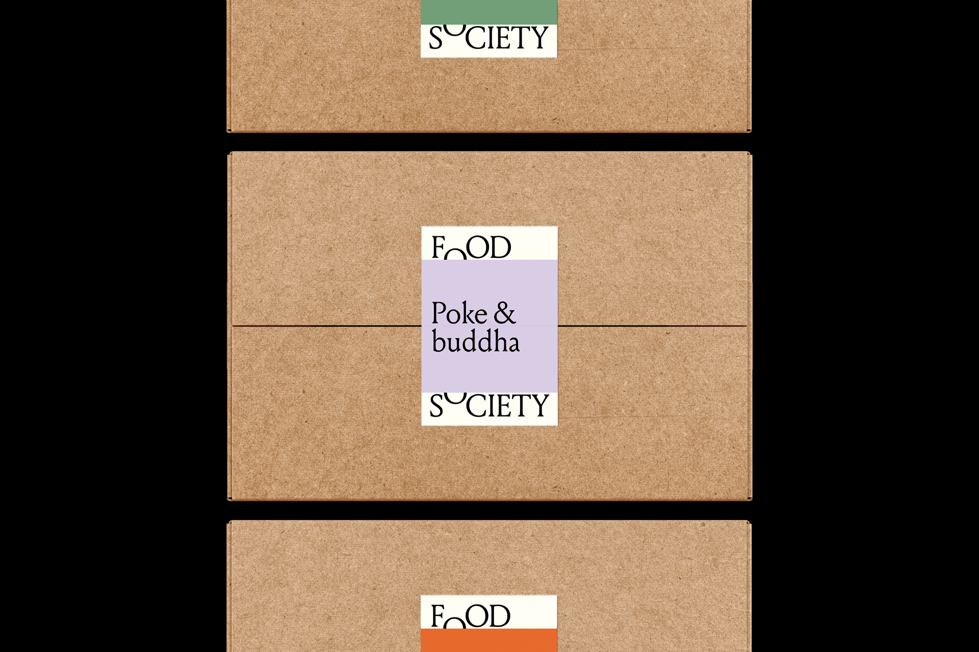
As a first gesture, the logo ‘O’ has the flexibility to open up, allowing different type of content to live within the brand.
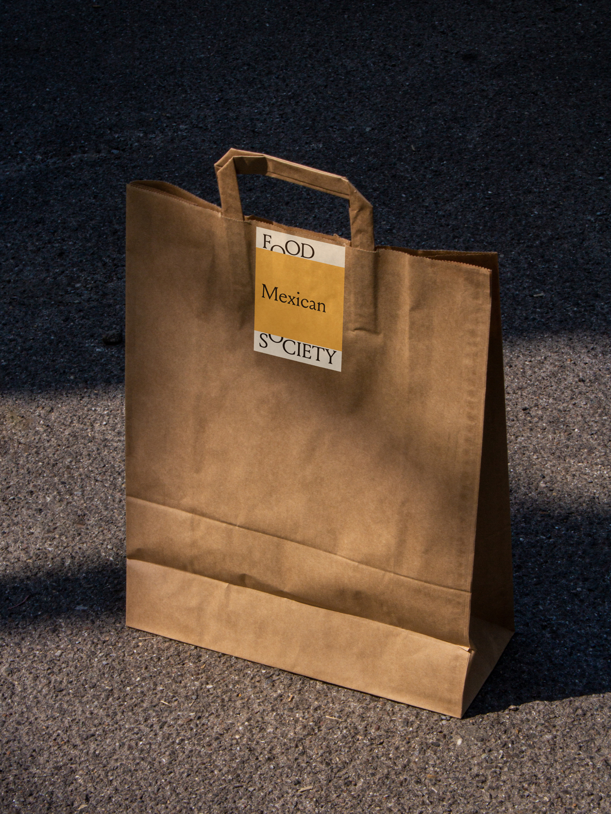
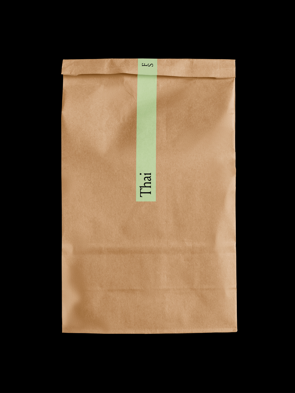
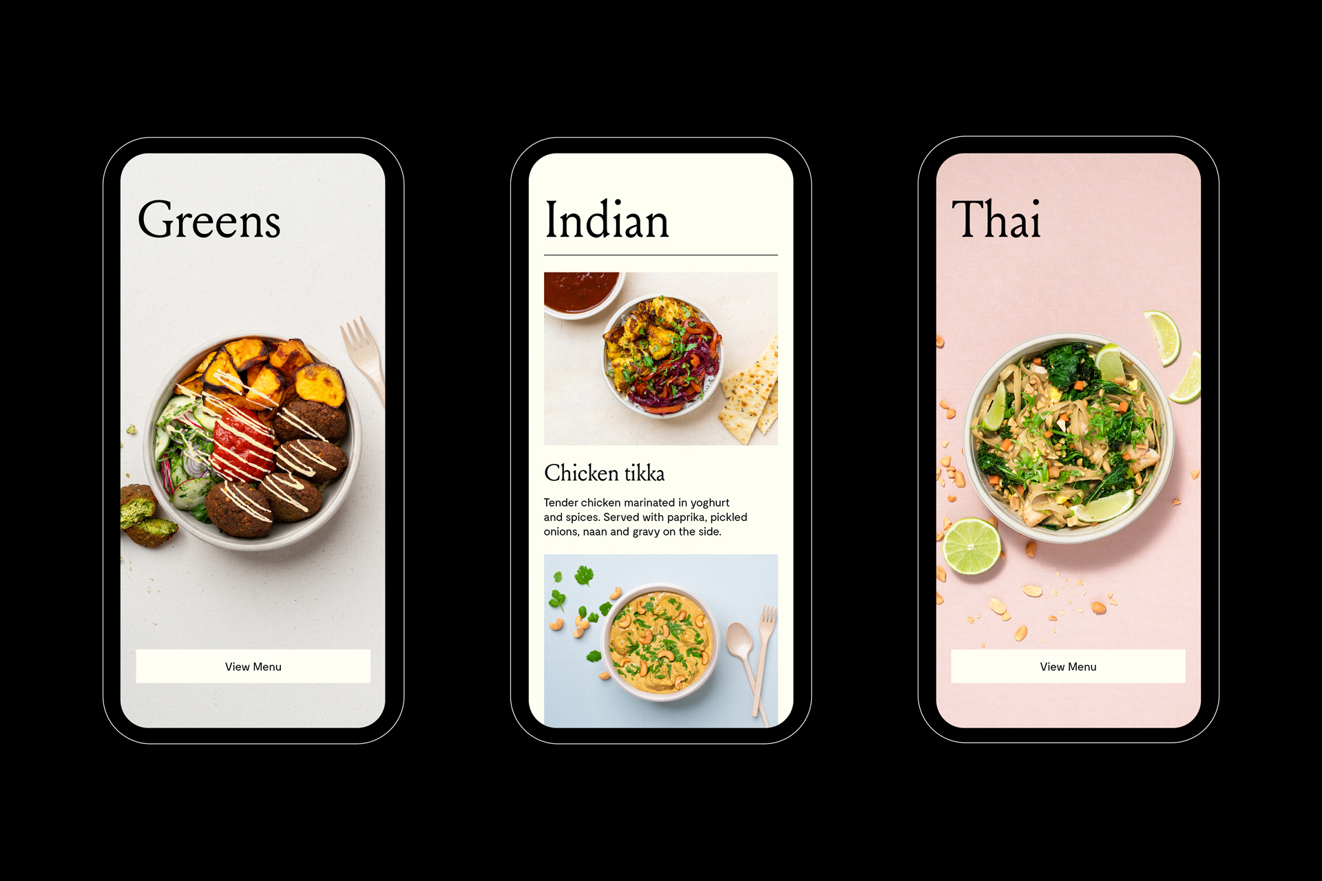
The core palette is soft and composed of subdued colours, empowering the different categories to hold a stronger visual expression. The categories colours are vivid and bold, enabling each kitchen to take on a differentiated and recognizable tone. This flexible colour system allows the palette to continuously grow as new kitchens join the society.
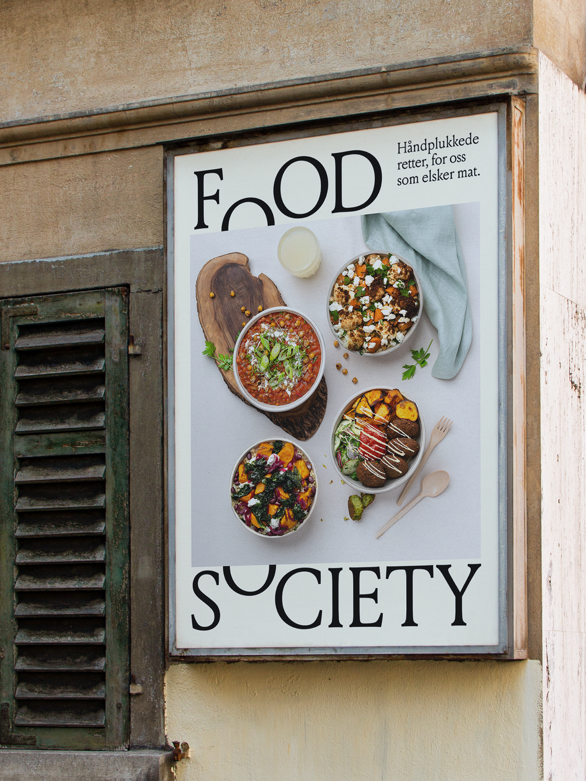
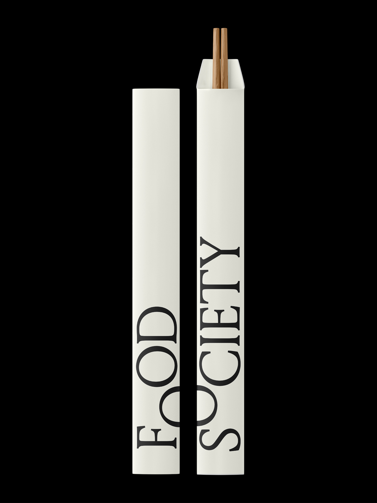
The soft and rounded forms of the typography bring an appetizing quality to the communications, expressing a sense of warmth and delight.
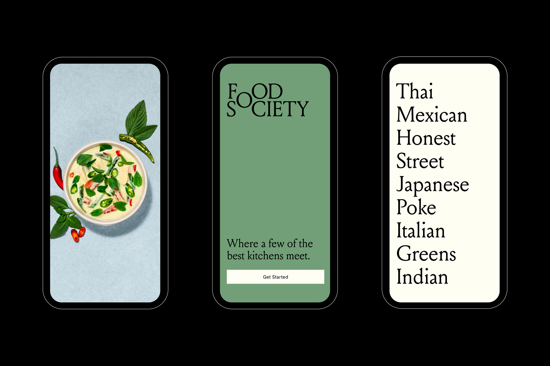
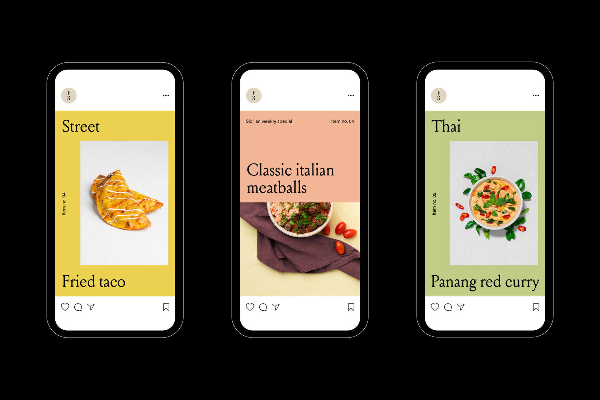
As each ingredient and dish are carefully selected, product photography focuses on the curation aspect of the brand. Images are clean, simply putting the emphasis on the dish as the central elements.