Remix the infinite
NRK is the Norwegian government-owned radio and television public broadcasting company, and the most extensive media organisation in Norway. It broadcasts three national TV channels and three national radio channels.
Category→
Media
Work→
Visual identity, art direction, design system
Awards→
Visuelt
Client→
NRK
Challenge
NRK P3 was established in 1993. From its early stages on, NRK P3 set important impulses to Norway’s contemporary pop and music culture. Not at least because of increasing social media presence, their target group constantly gets younger and younger. NRK noticed that there were changes to be made to keep P3’s outfit and experience fresh and appealing to a new generation.
Bleed was approached to redesign the channels visual identity for NRK P3. This not only included a new approach to the brand’s basic feel but relies on the definition of a system that challenges its main touchpoint: Primary motion-based screen implementation on web and social media.
The new visual identity aims to connect NRK P3 closer to NRK, enhance it's brand values and make it a clearer sender on all platforms.
— Cecilie Lyng, Profilsjef @NRK
Solution
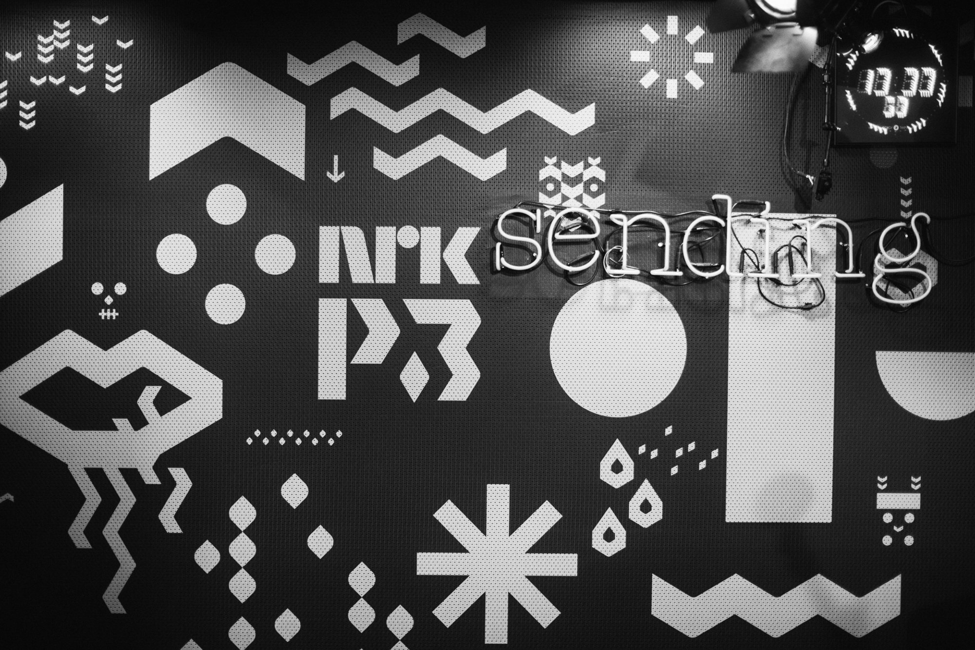
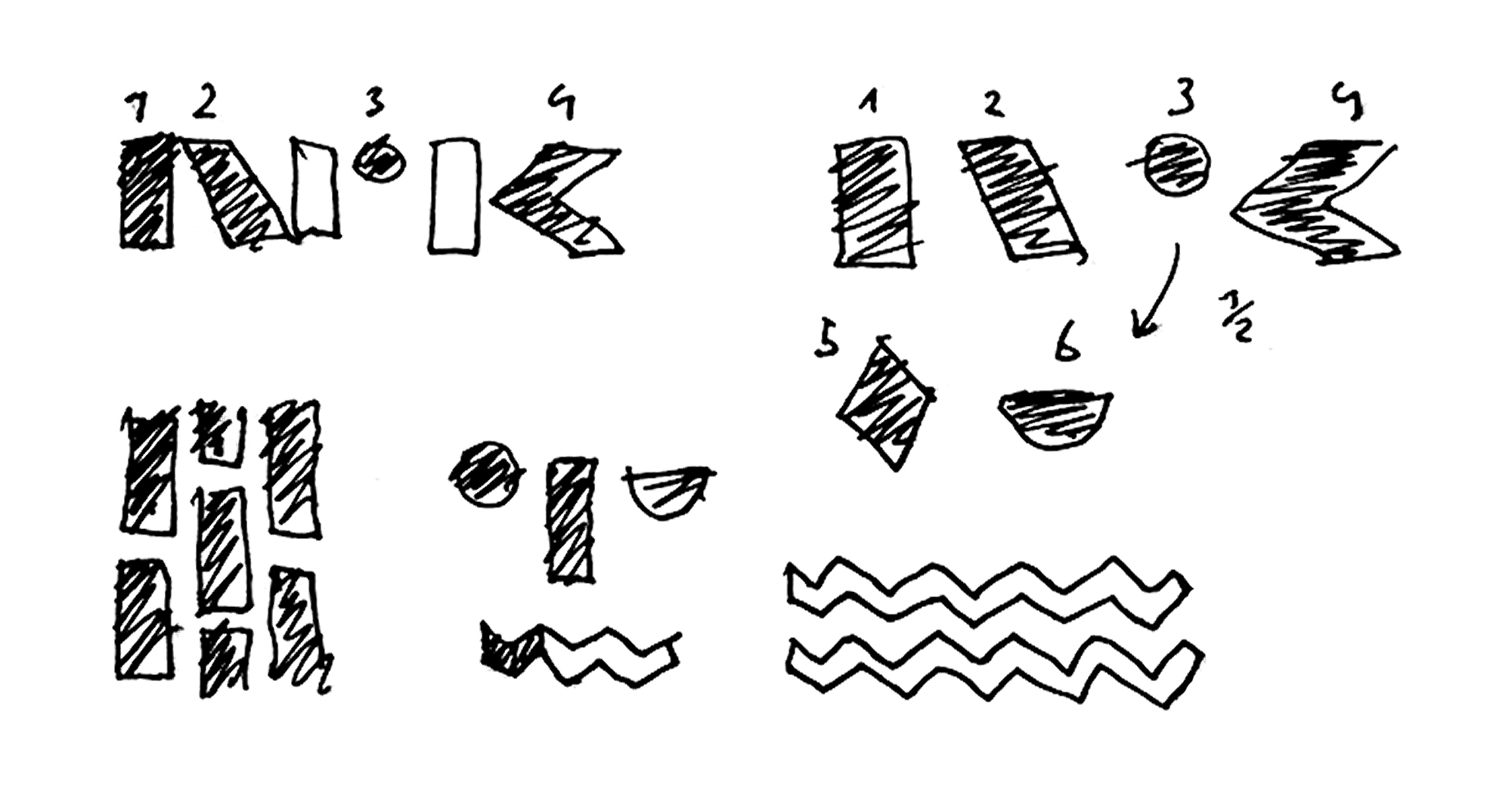
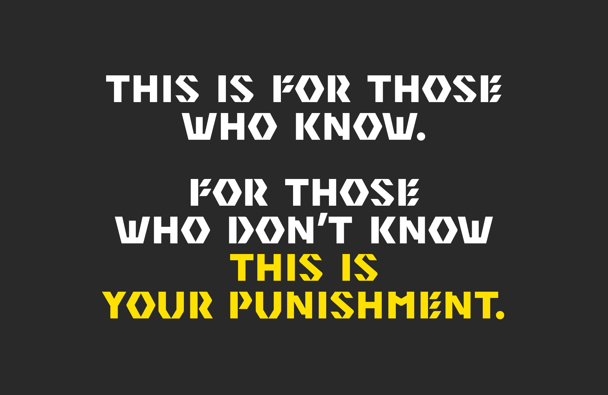
During a research investigation into the channels setup, we explored that it was »populated« by a wild bunch of charming people hosting different programs like a highly frequented morning show, different genre slots, entertainment-, news- and information-formats. This was when the idea of a "P3-tribe" came up with every person getting their totem symbol. While sketching around logos, symbols and icons, we know that we had to develop a strong graphic style first to combine it with the conceptual approach we had in mind.
We noticed that the official NRK-logo was constructed out of specifically geometric forms. In deconstructing the logo in its basic shapes, we generated a graphic vocabulary that had the strong autonomous approach we were looking for while also being flexible enough to play with it in unlimited ways – The concept of »Remix« was born.
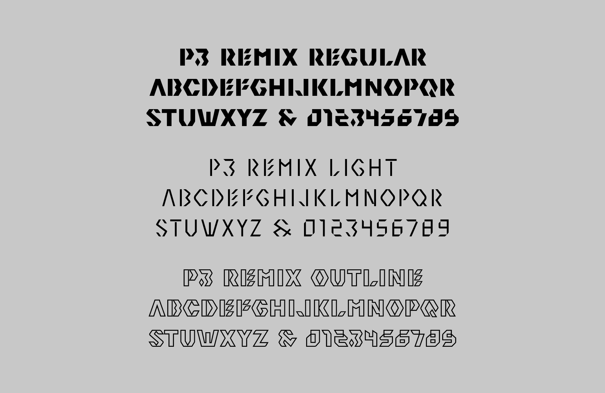
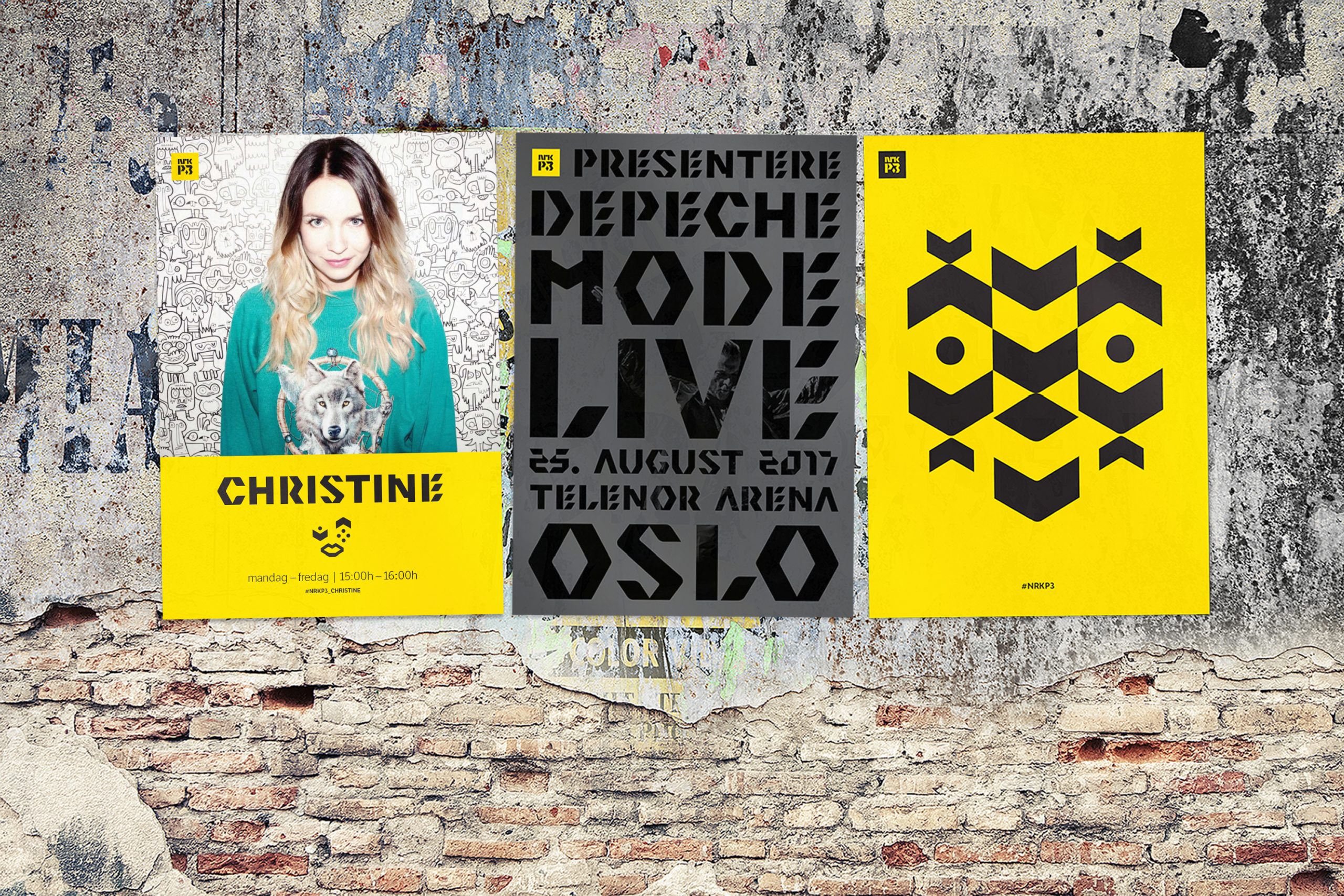
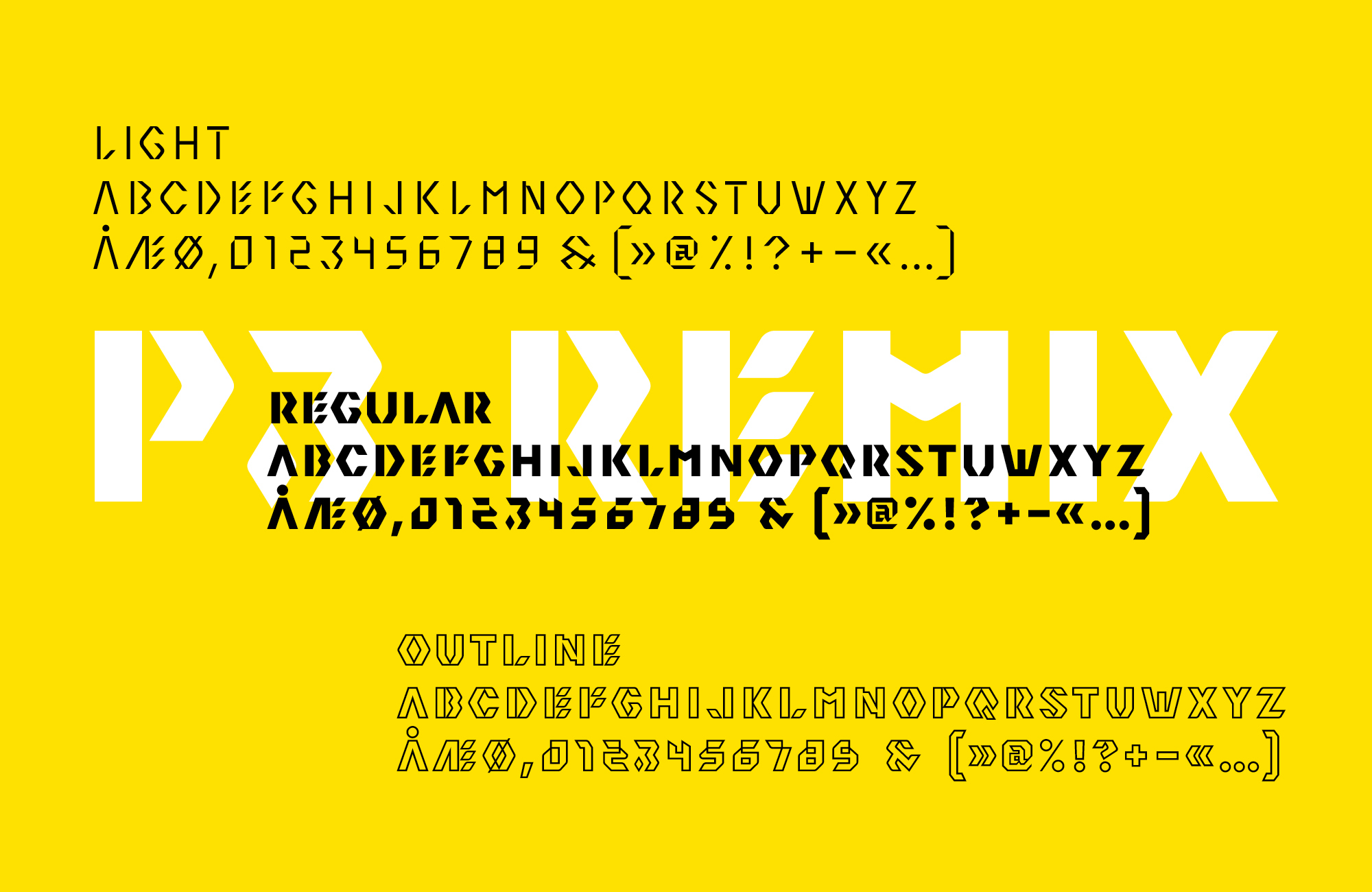
Next to the icon system, the concept of remix and it’s formal approach led to the design of an own typeface: P3 Remix! With its unique, edgy appeal the three styles – Regular, Light and Outline – support the brand’s spirit on various implementations such as screen design, posters and print media, signage, merchandise, and so on.
Result
The new visual identity of NRK P3 and its variety of elements are both stable and flexible enough to work on a wide range of media and got great recognition from the client.
In close cooperation with the in-house department of NRK P3, we were able to work on the actual practical needs of the identity also as a tool for the journalists and employees to work with.
At this stage, the identity gets integrated step-by-step into the current system of NRK with all kinds of media to follow.