Fashion is only the attempt to realize art in living forms and social intercourse.
—Francis Bacon
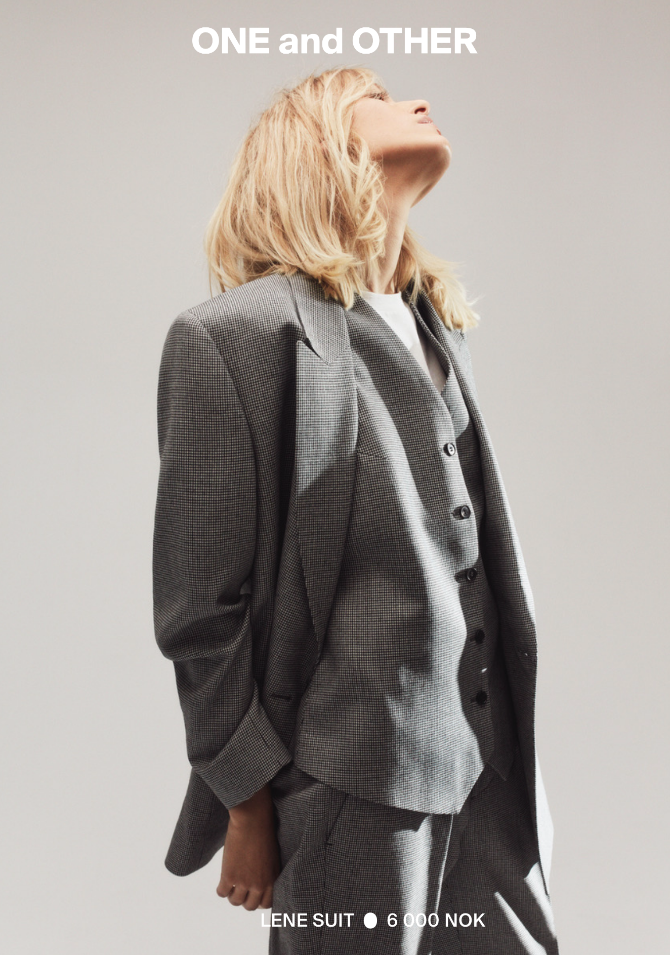
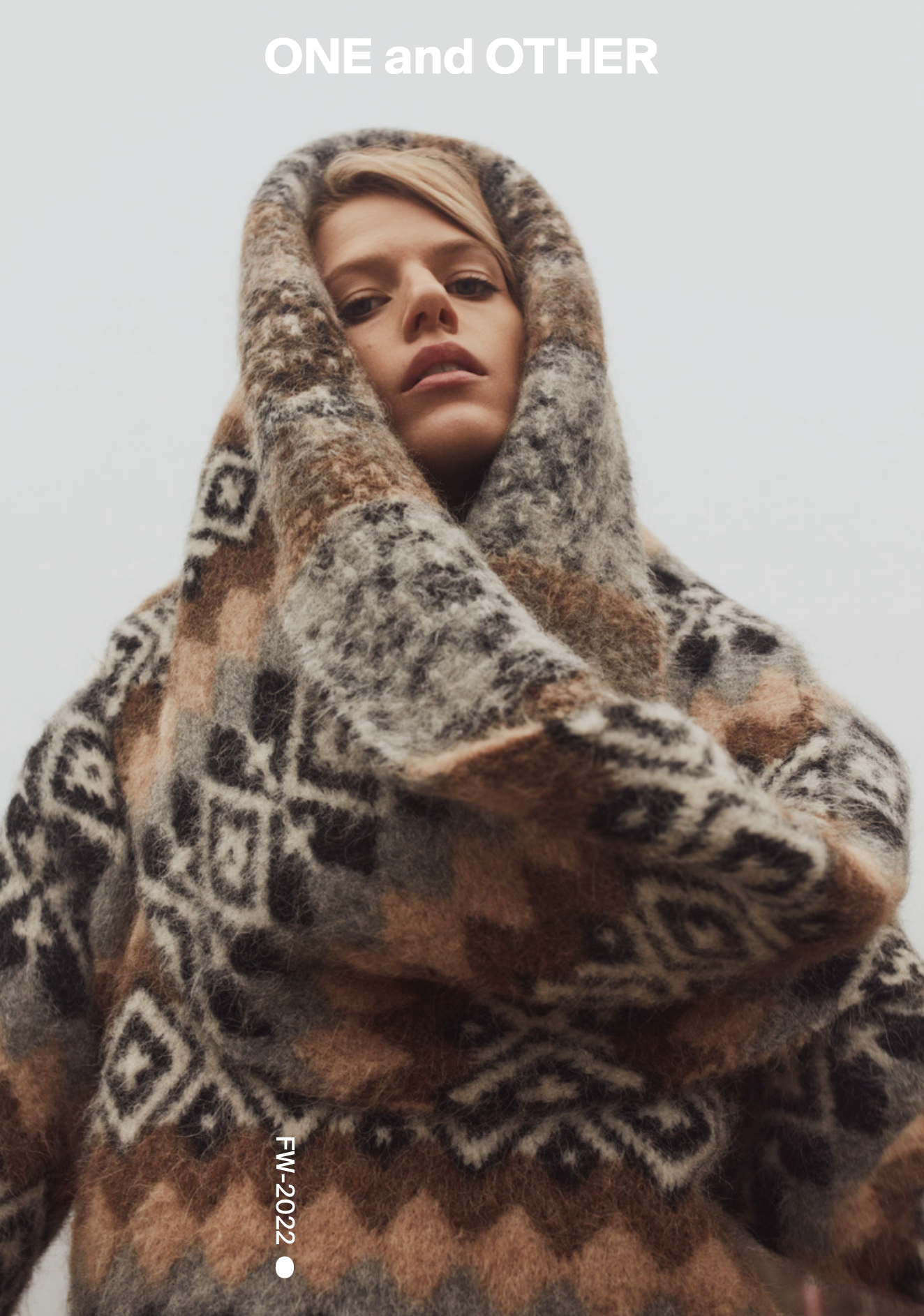
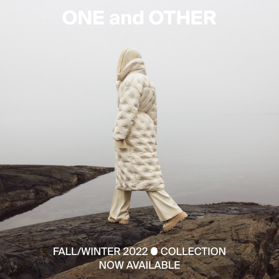
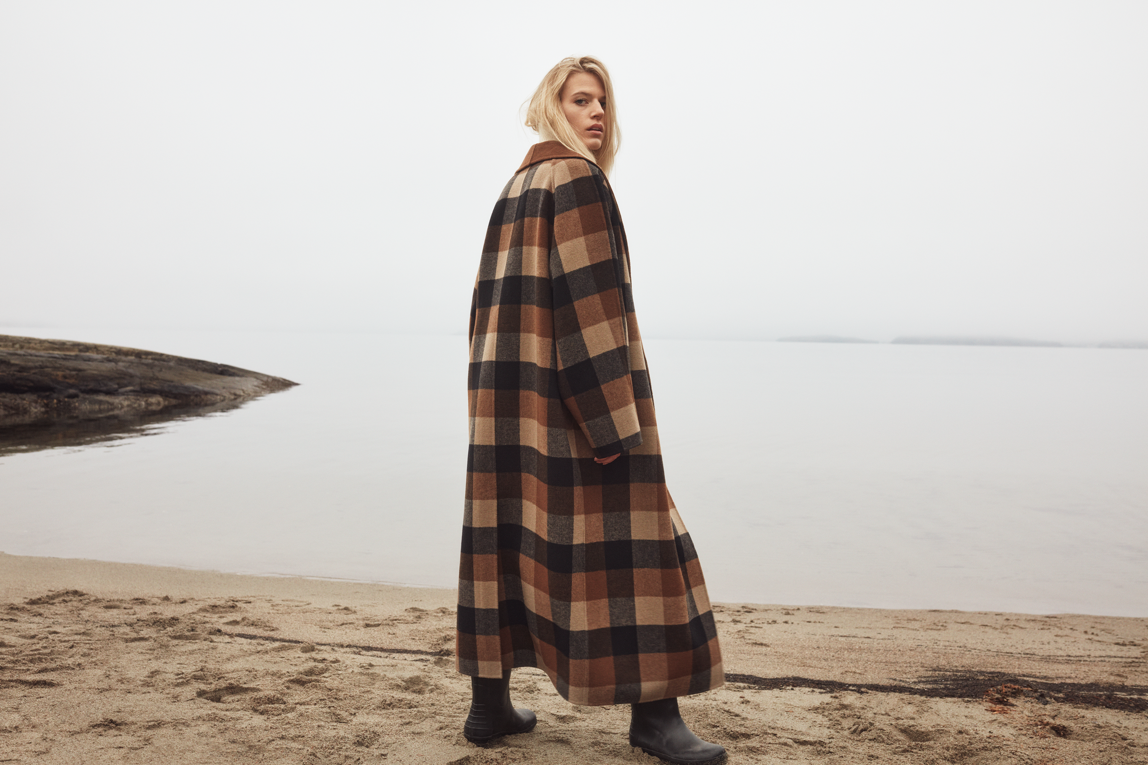
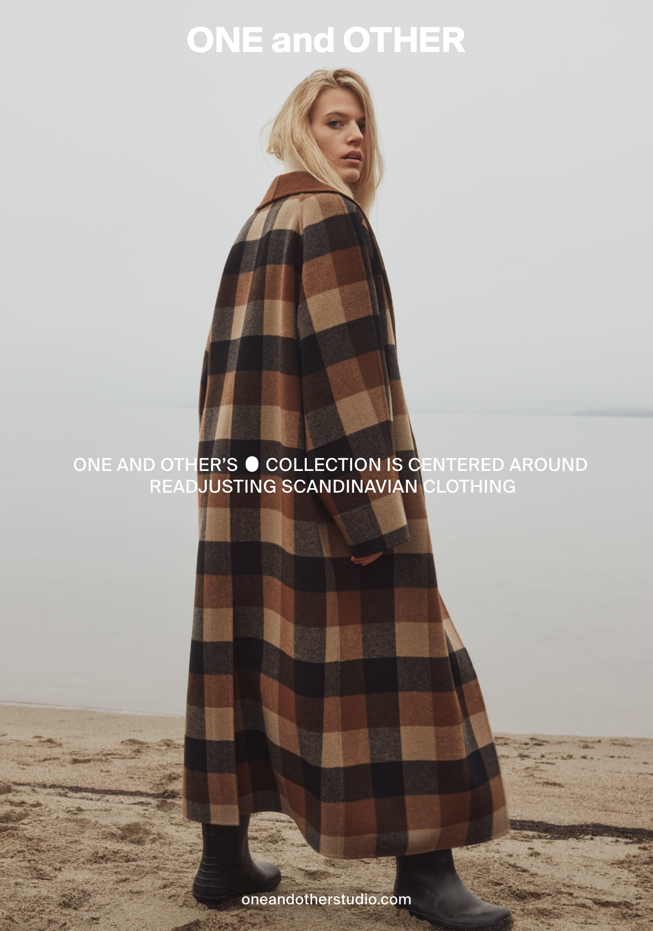
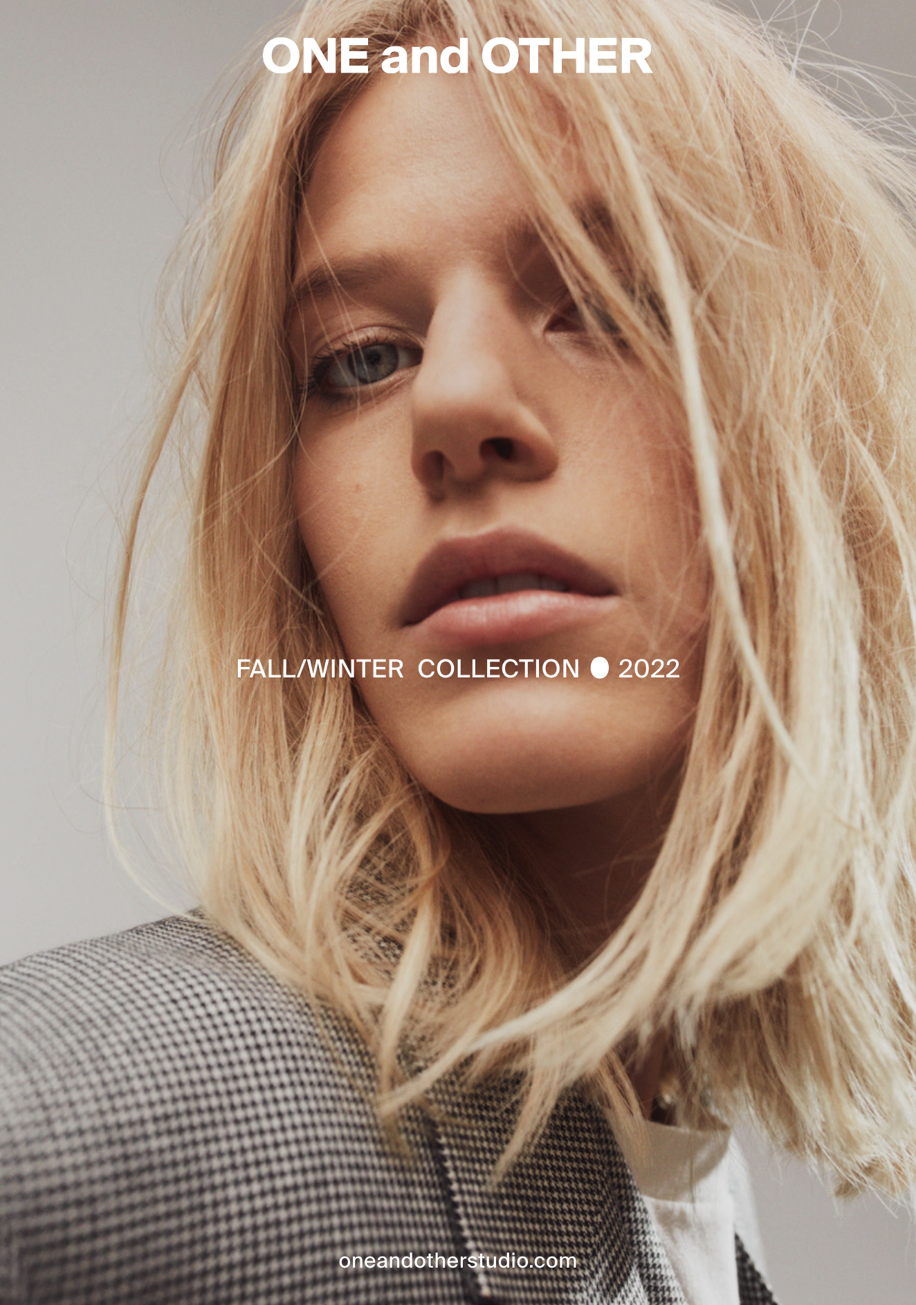
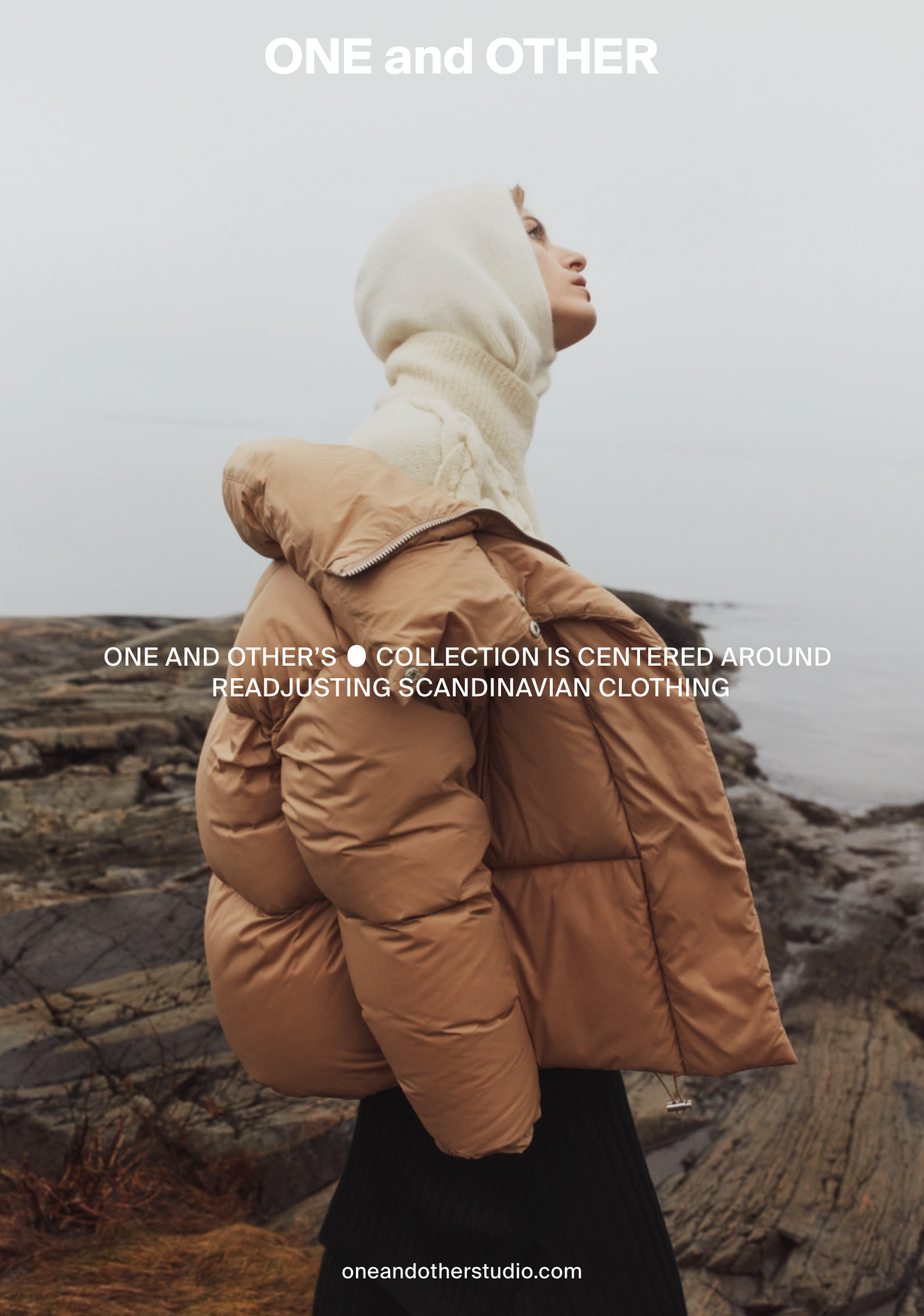
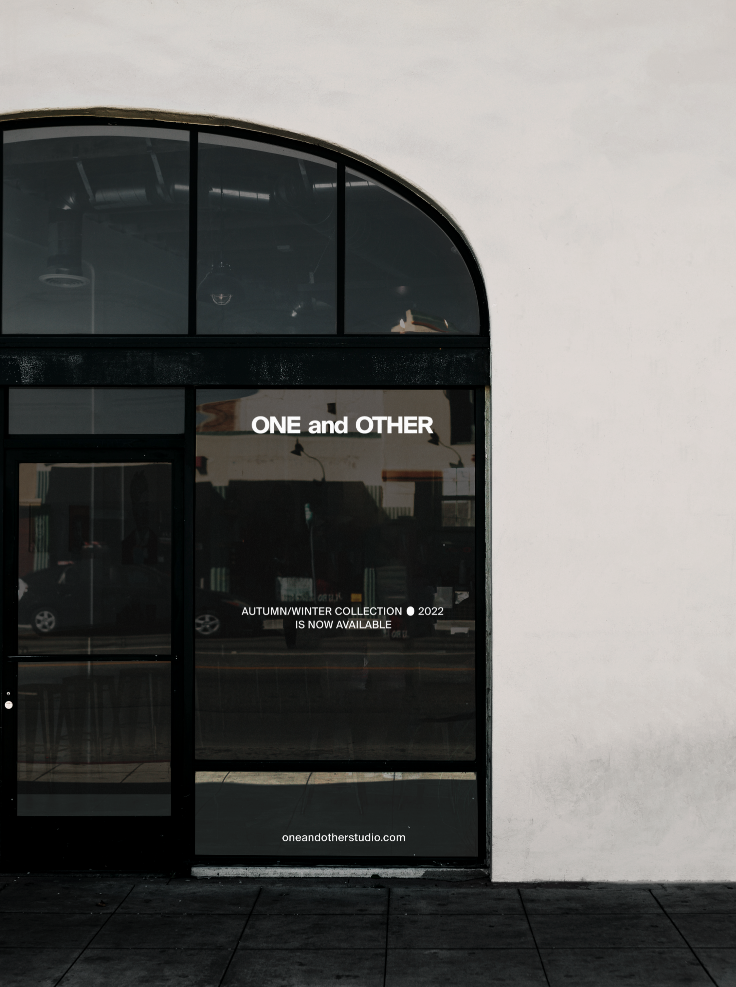
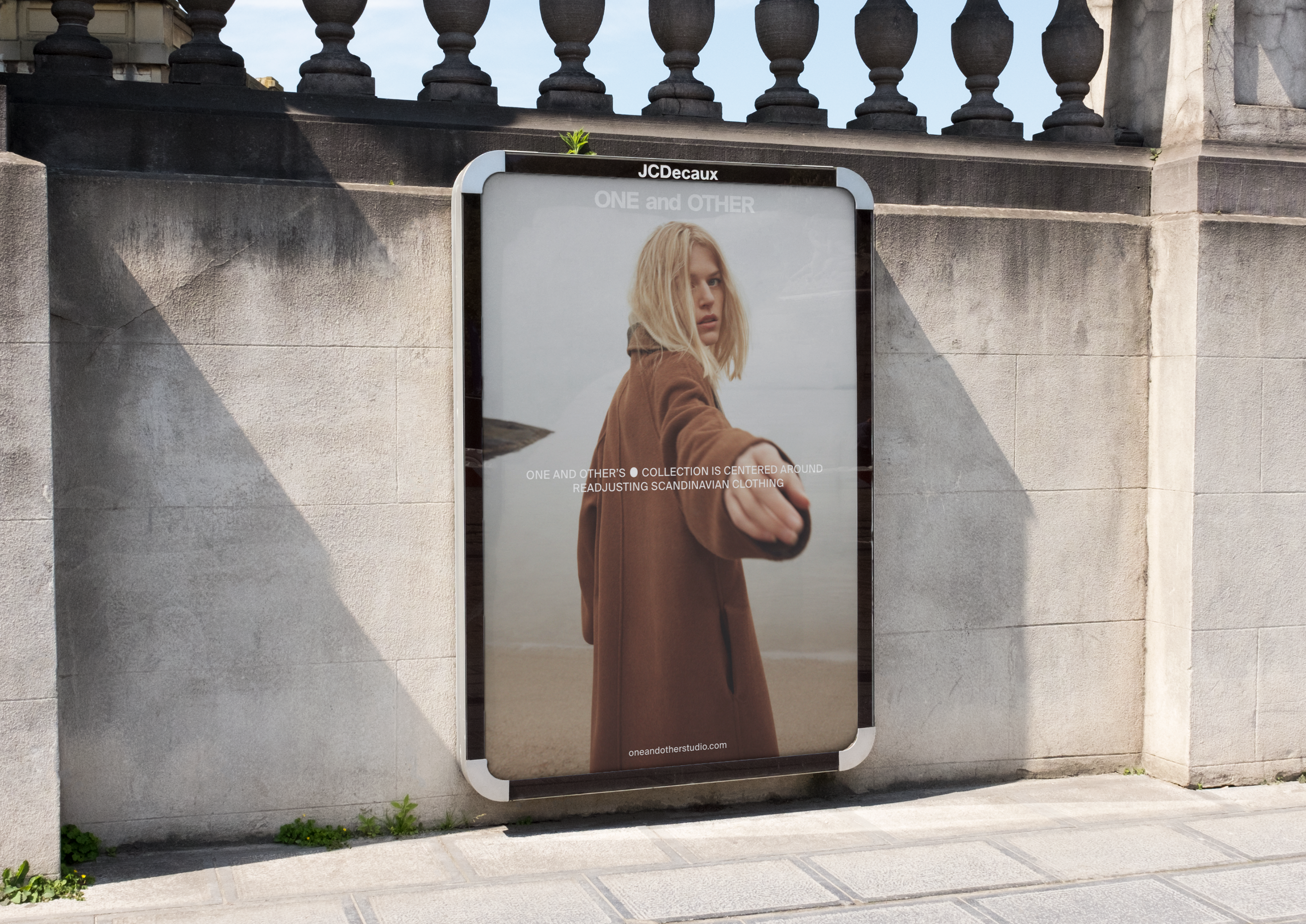
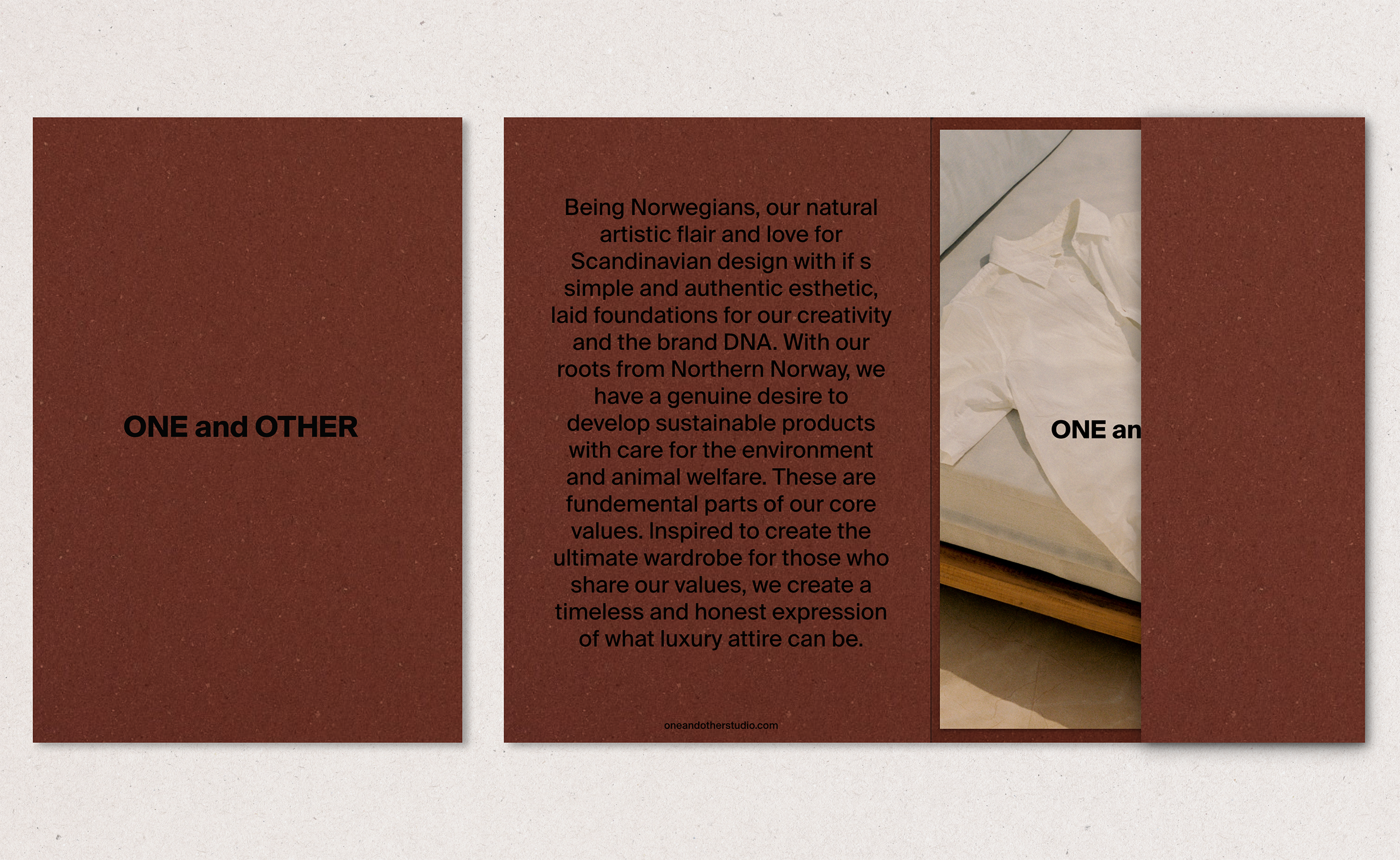
Fashion brand ONE and OTHER, based in Oslo, develop sustainable products with timeless and honest expression of what luxury attire can be.
Category→
Fashion
Work→
Visual identity, rebrand
Awards→
TBA
Client→
ONE and OTHER
Concept
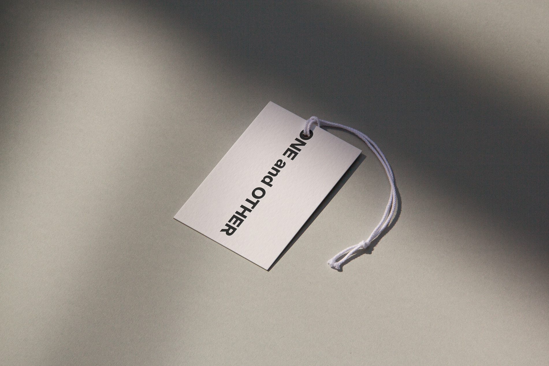
Our goal was to created an identity that mirrors ONE and OTHER's core responsibilities; Resulting in an ambient and sophisticated brand that revolves around inverted 'O'. It was appropriate to create a wordmark that became a funcional element merged with information in a simple and iconic way.
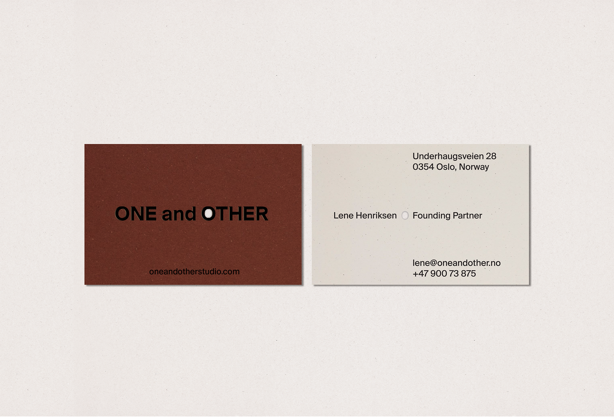
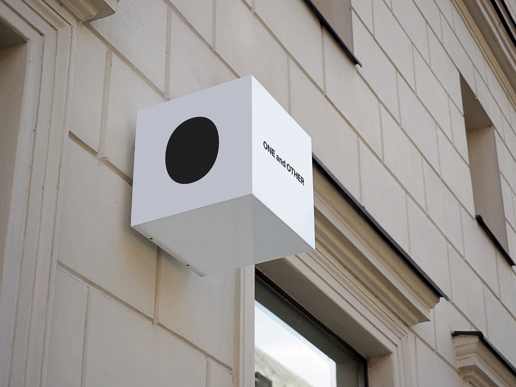
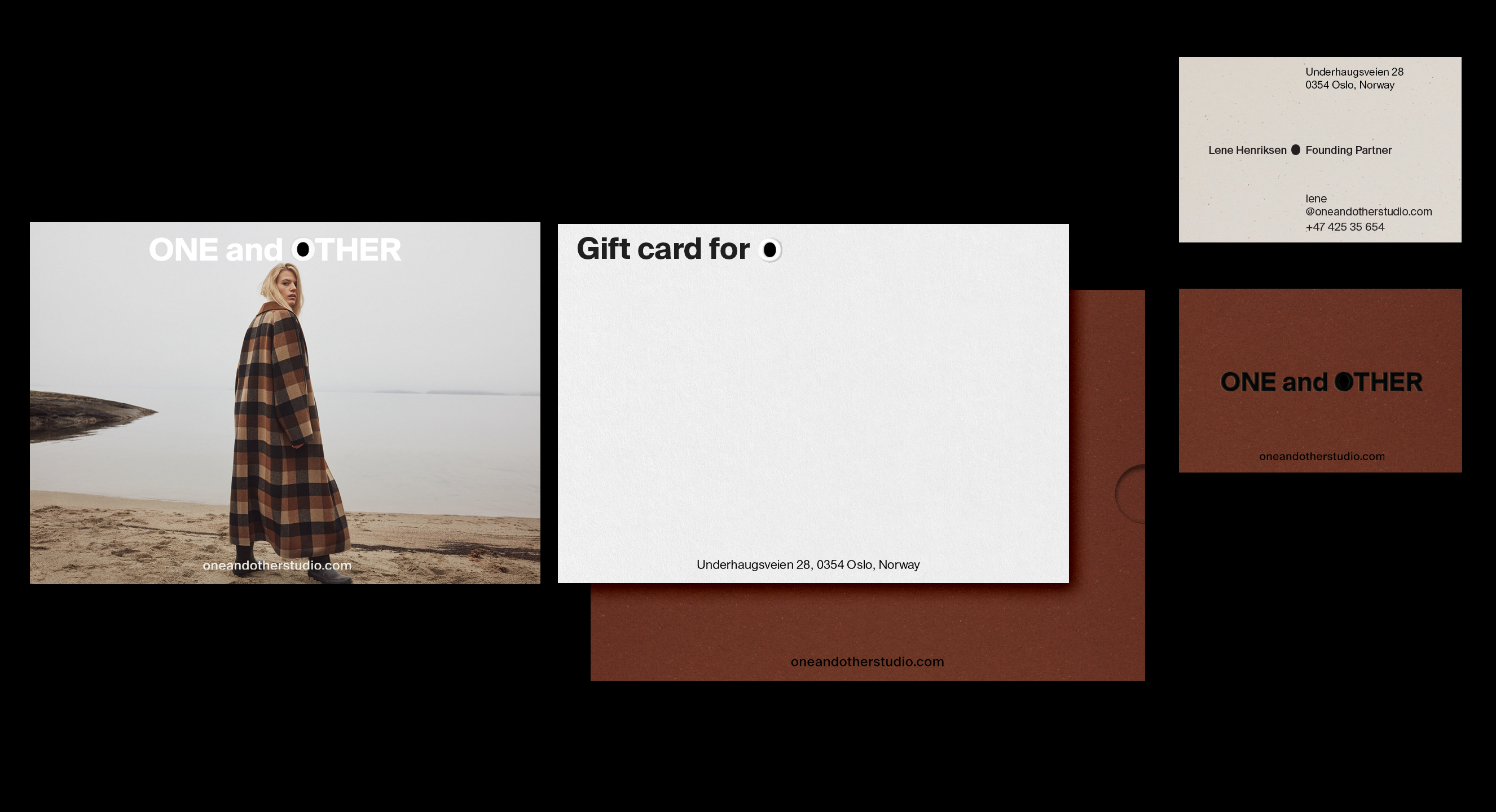
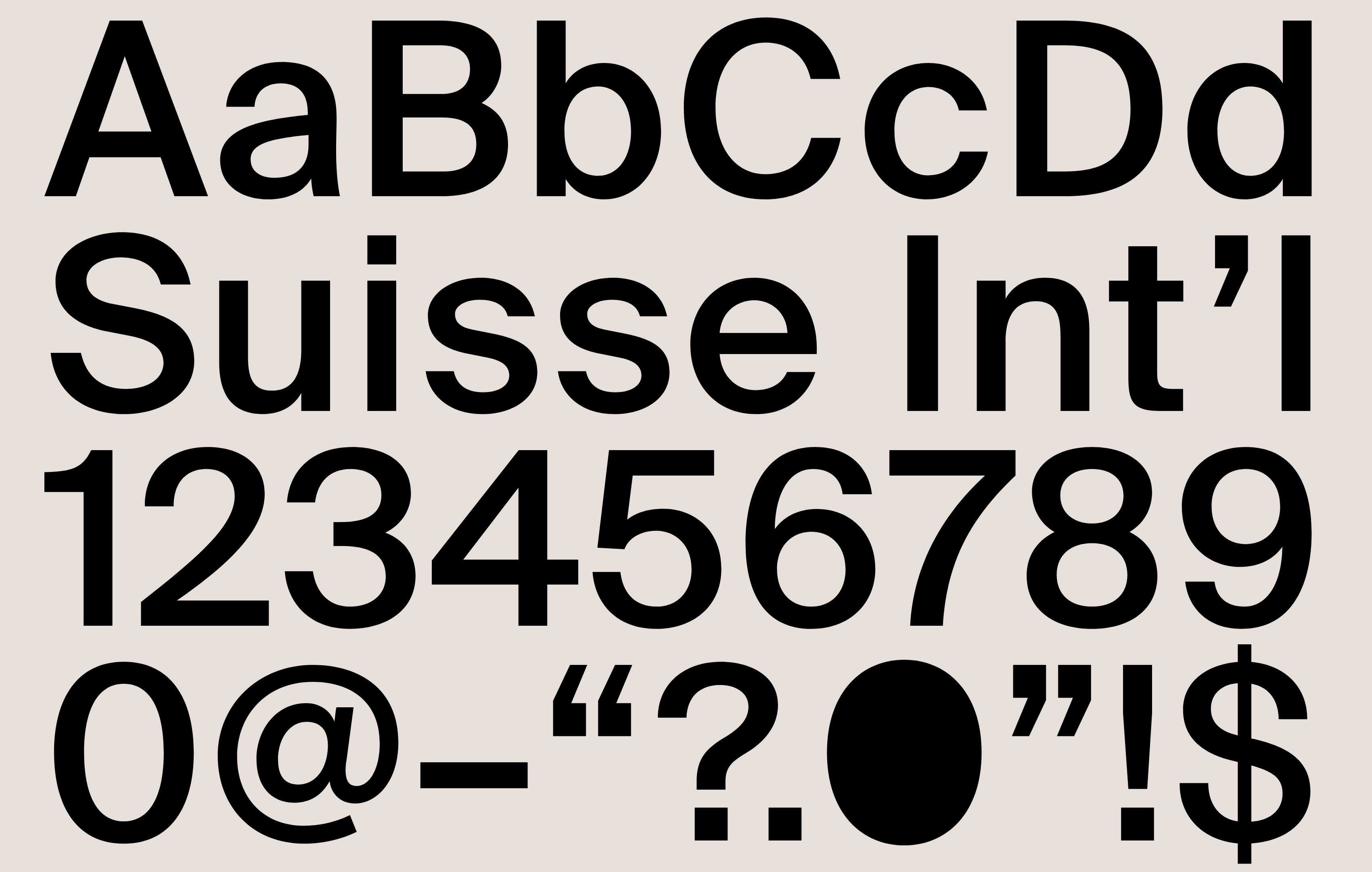
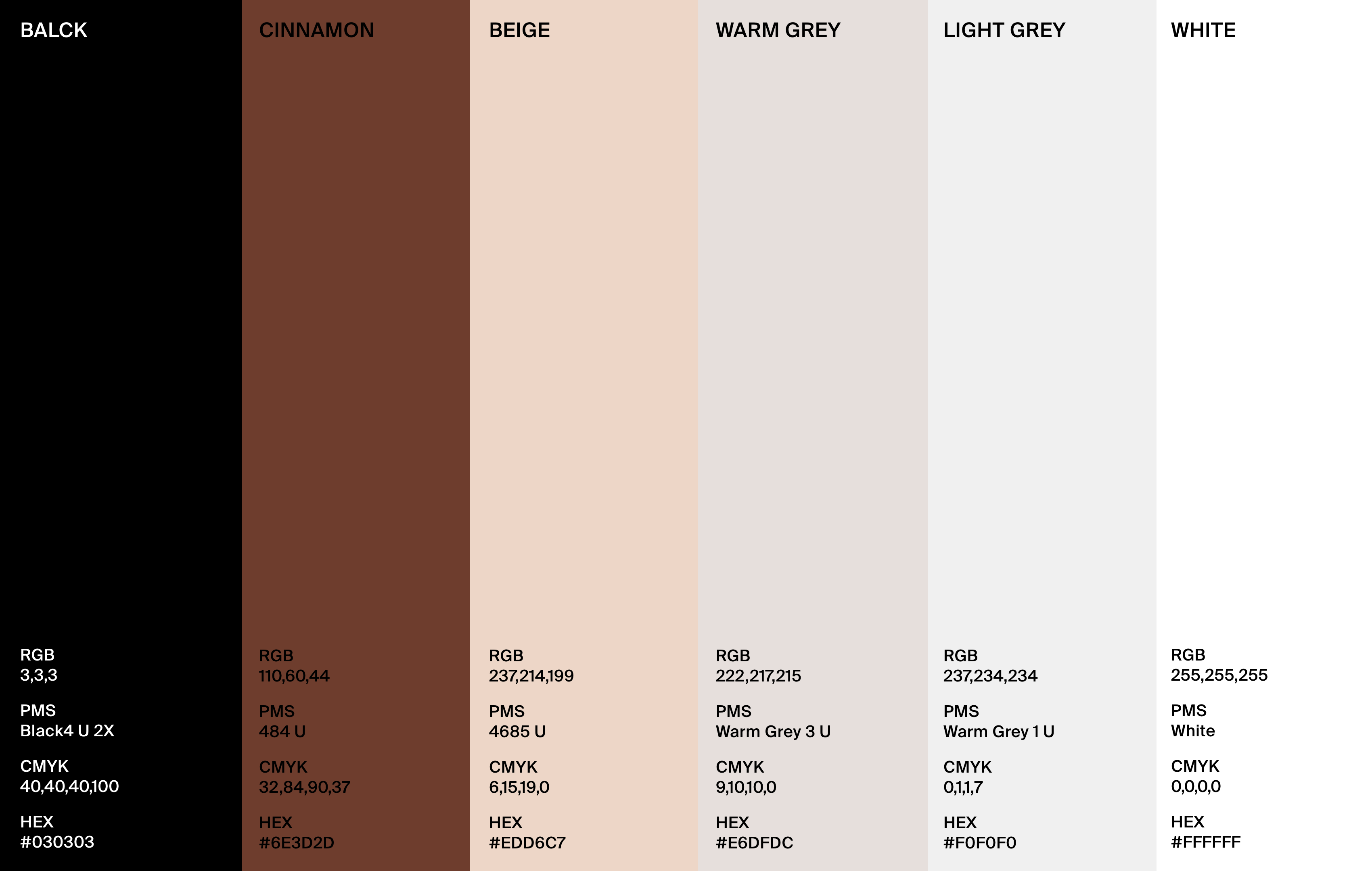
Typography and colors
Blend of monochromatic and earthy colours provides a layer of warmth. In line with the Suisse Int'l typeface, it has minimalistic and elegant look with a clean and timeless style.
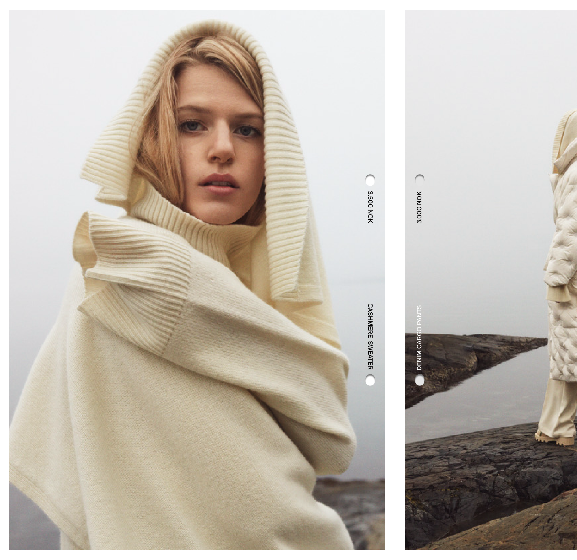
Layout
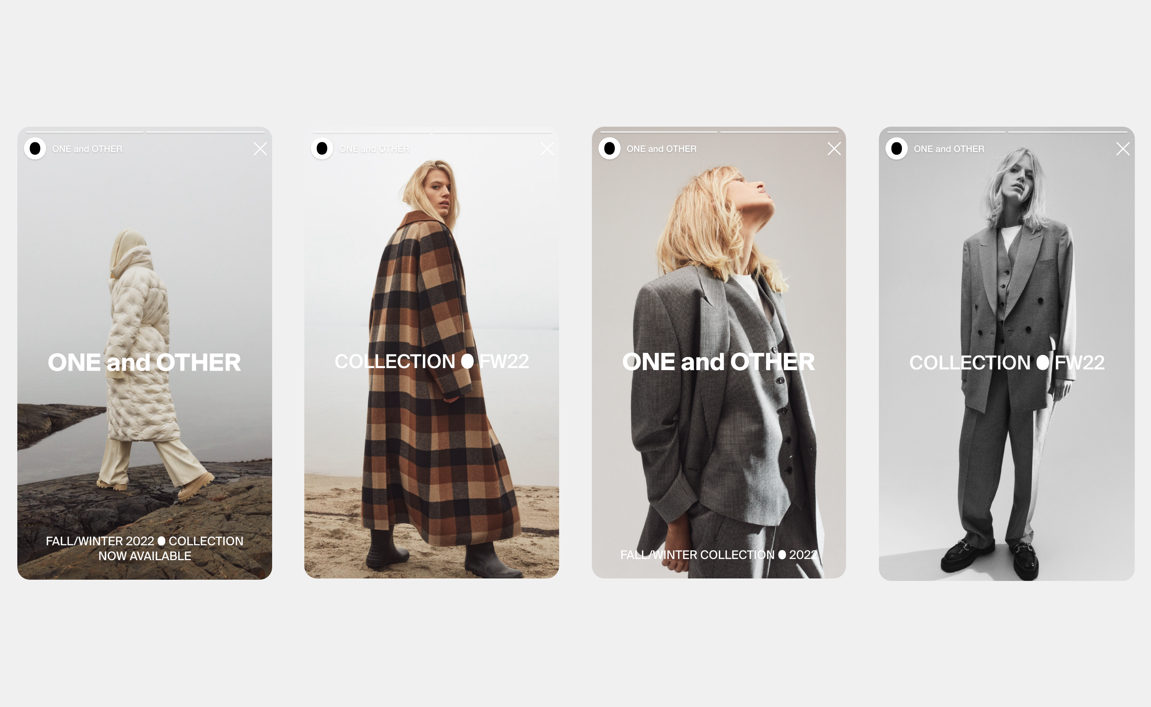
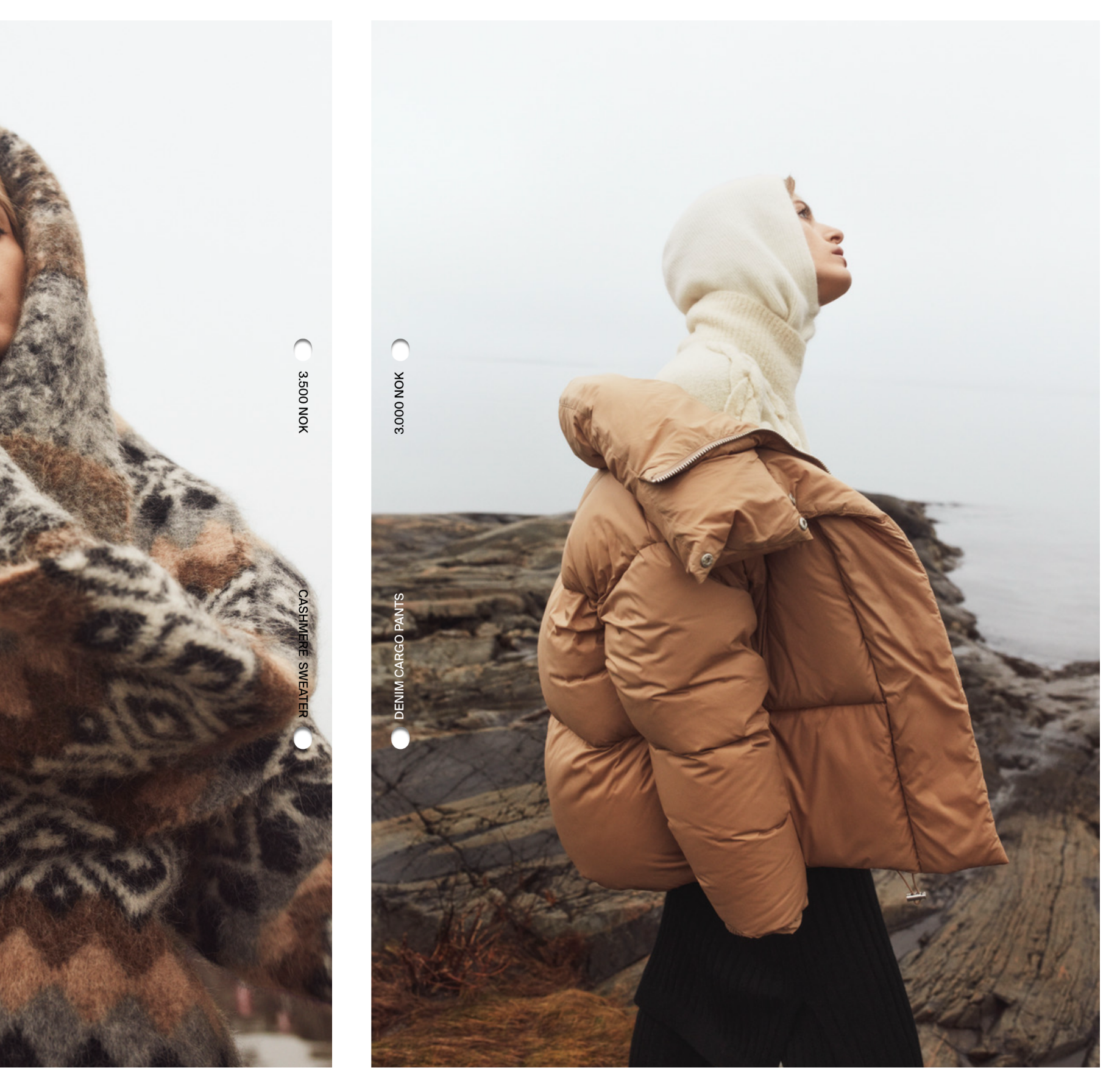
Keeping the identity clean while reflecting a minimalistic approach, the visuals are intentionally simple. We have created a system with a lot of flexibility in use with the photography.
Text compositions level 1
Text compositions level 2