Electrify things
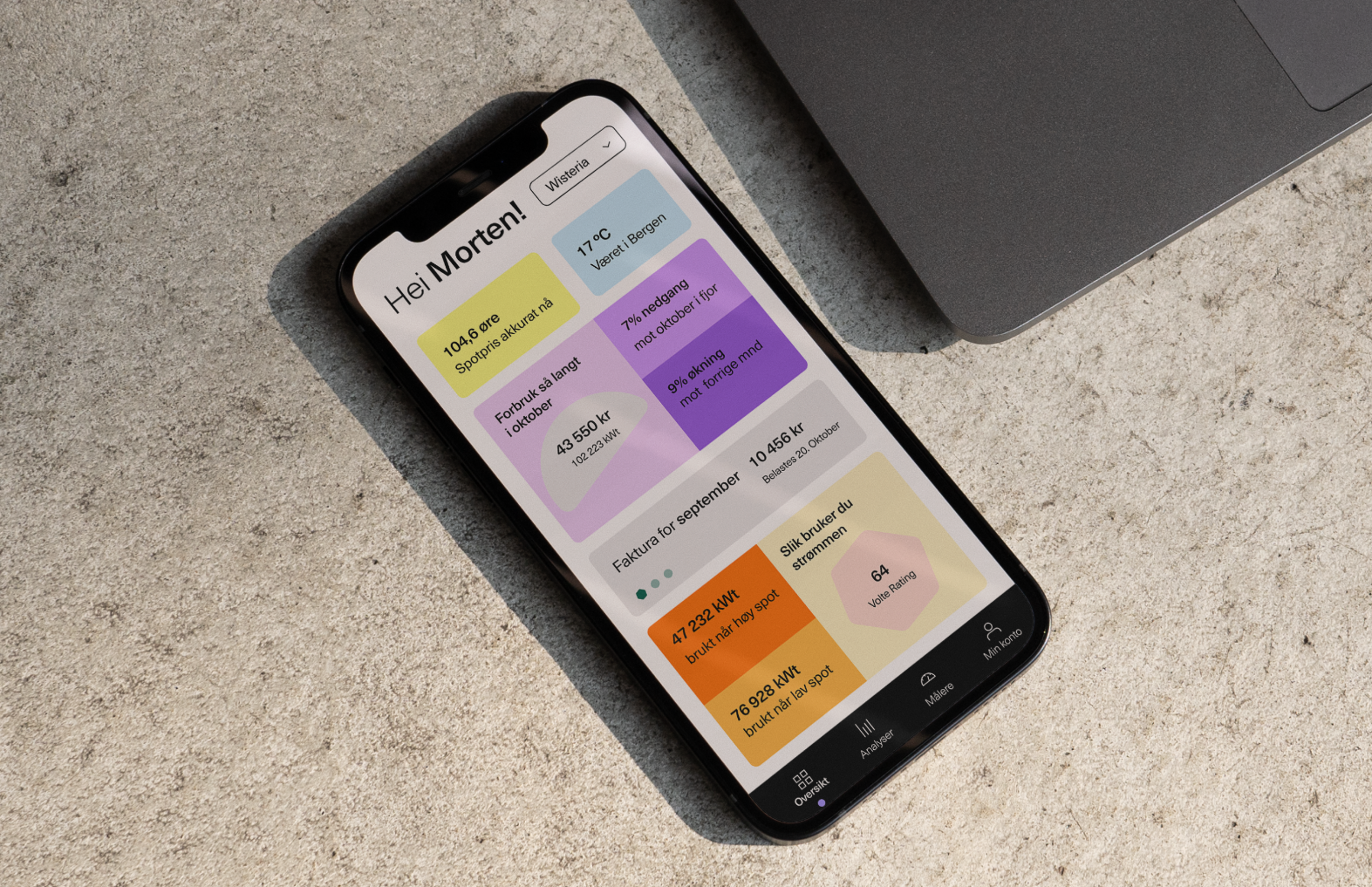
Volte is a B2B energy provider, aiming to minimize the bills for their clients. Rather than "upping" their sales, they urge their clients to use as little energy as possible.
Category→
Technology & Business
Work→
Visual identity, digital design
Awards→
TBA
Client→
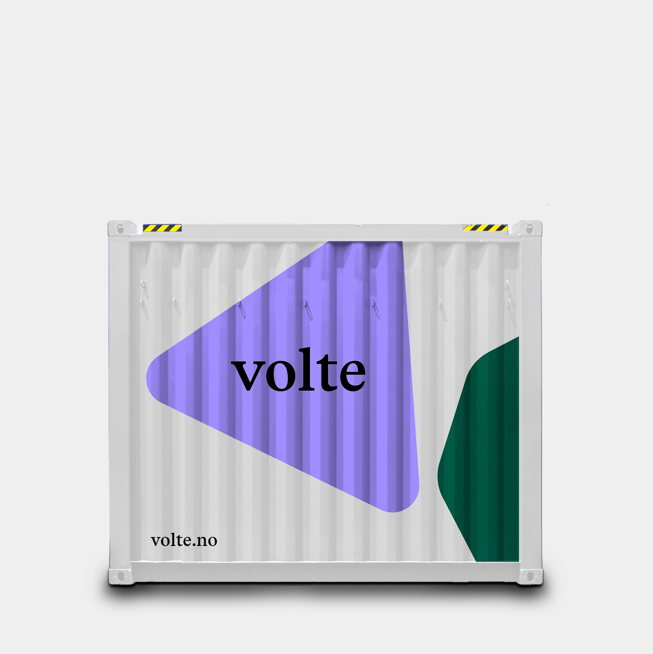
BKK Volte
Concept
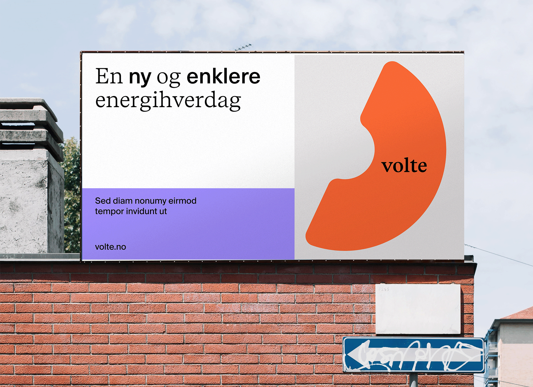
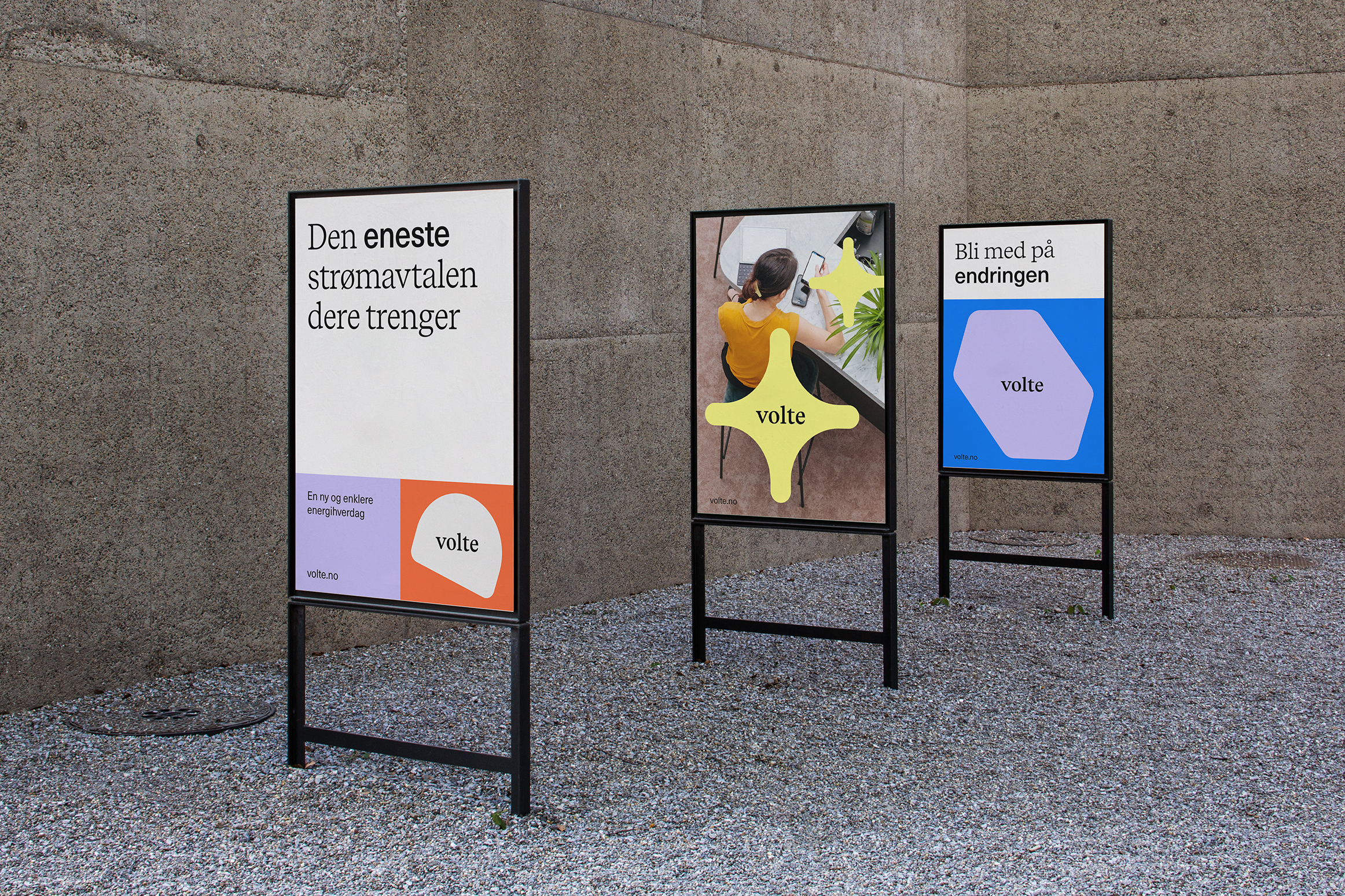
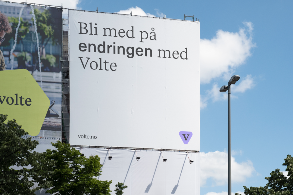
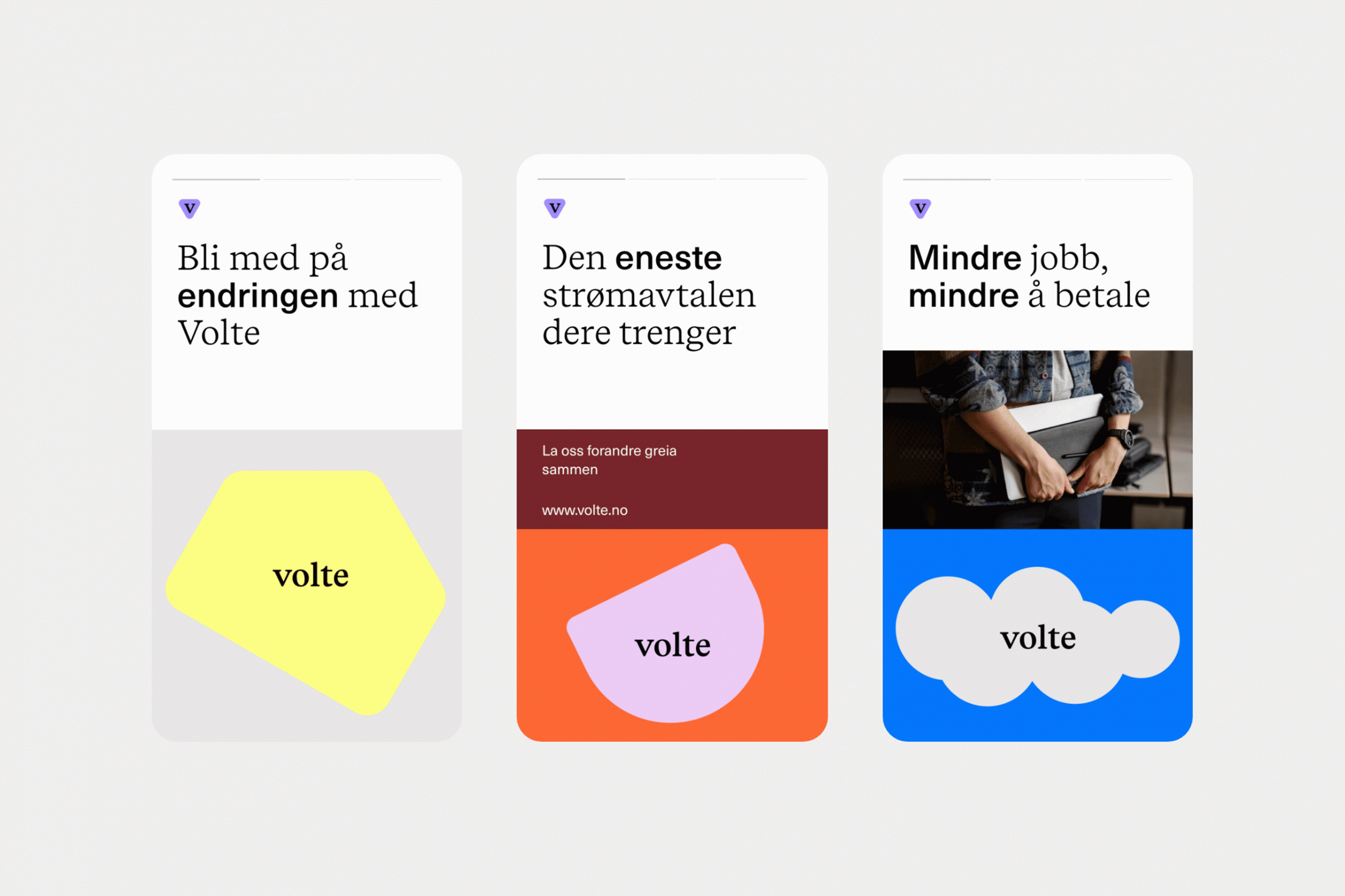
The visual concept seeks to challenge the traditional, conformist aesthetics that characterize the energy market. Our goal was to create simple, yet playful identity with the feeling that convey more accessibility, versatility and universality. The identity plays around the idea of how the electricity transforms and evolves.

Typography and colors
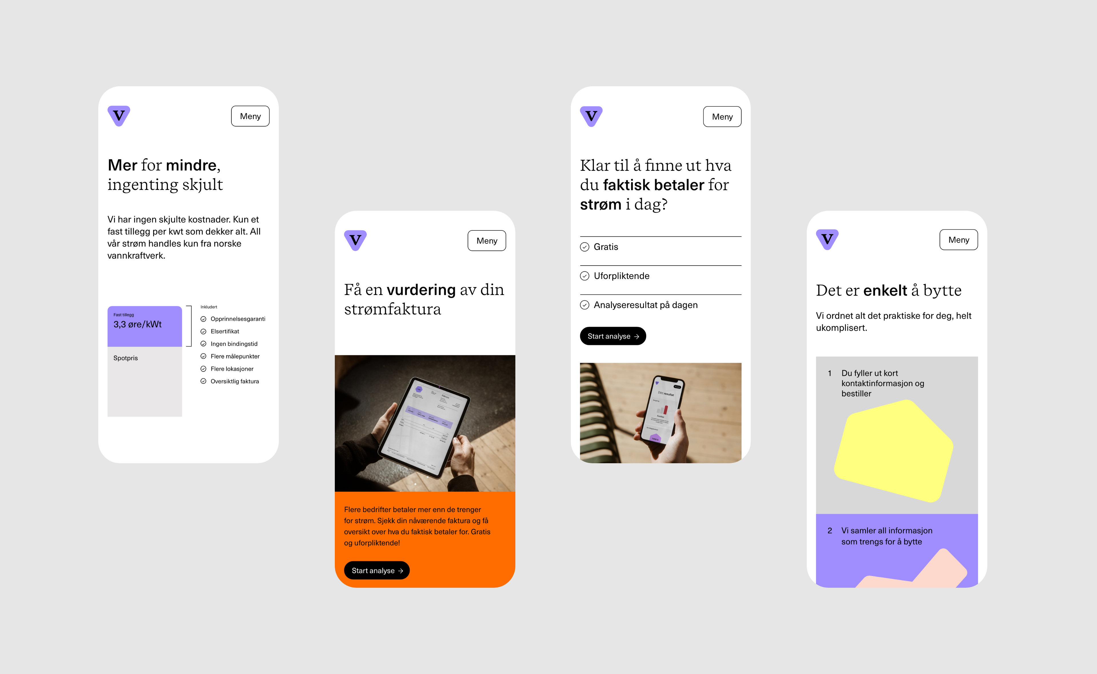
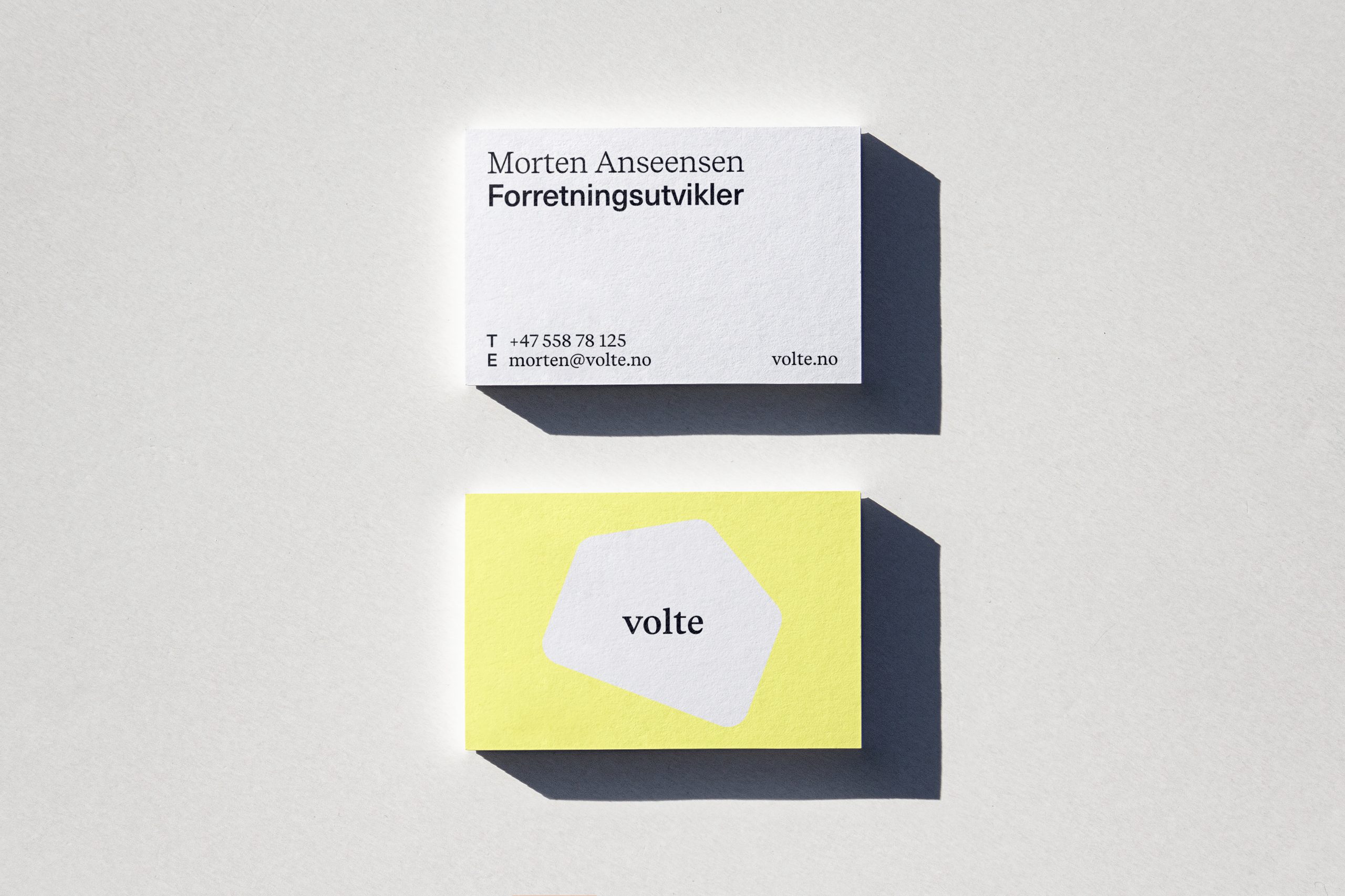
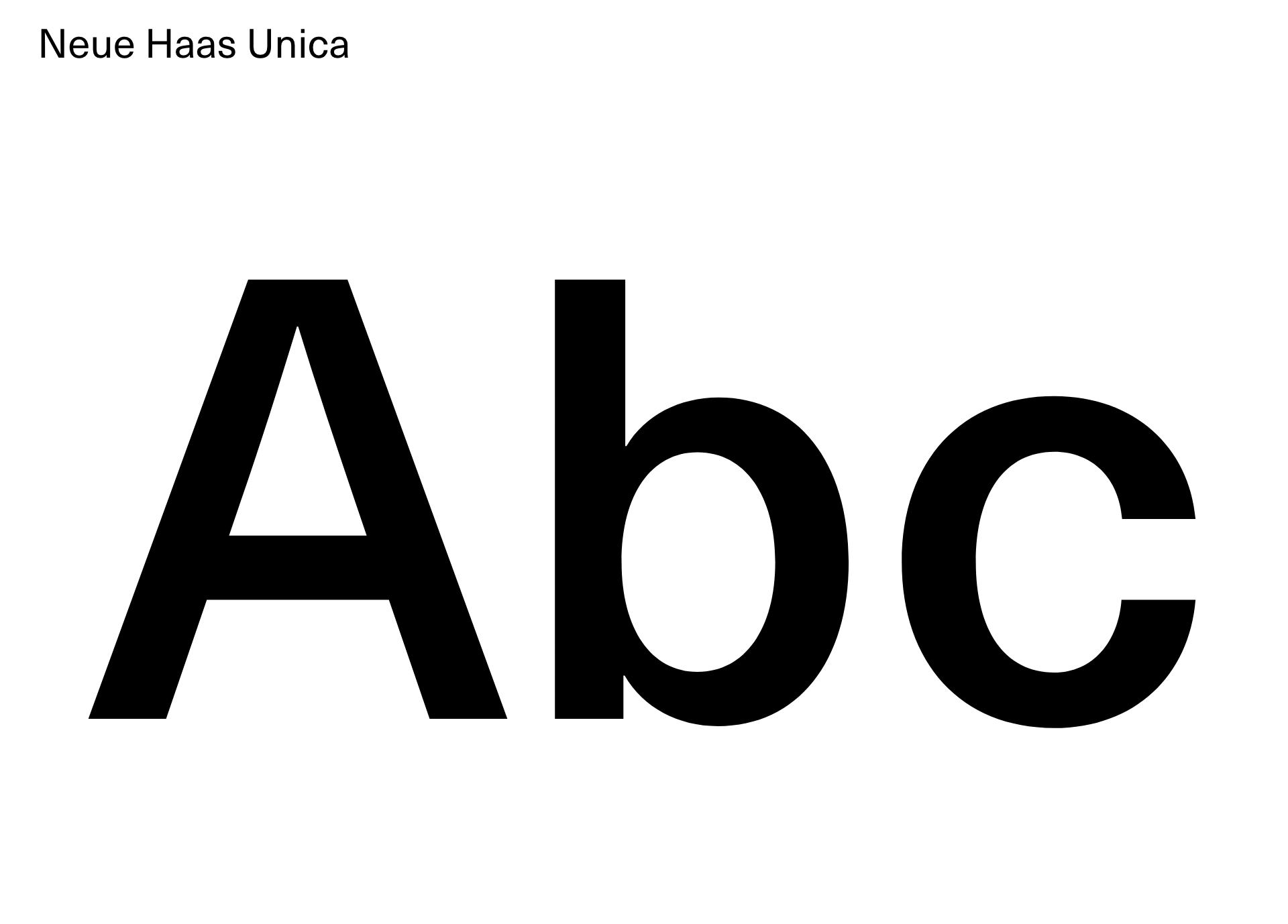
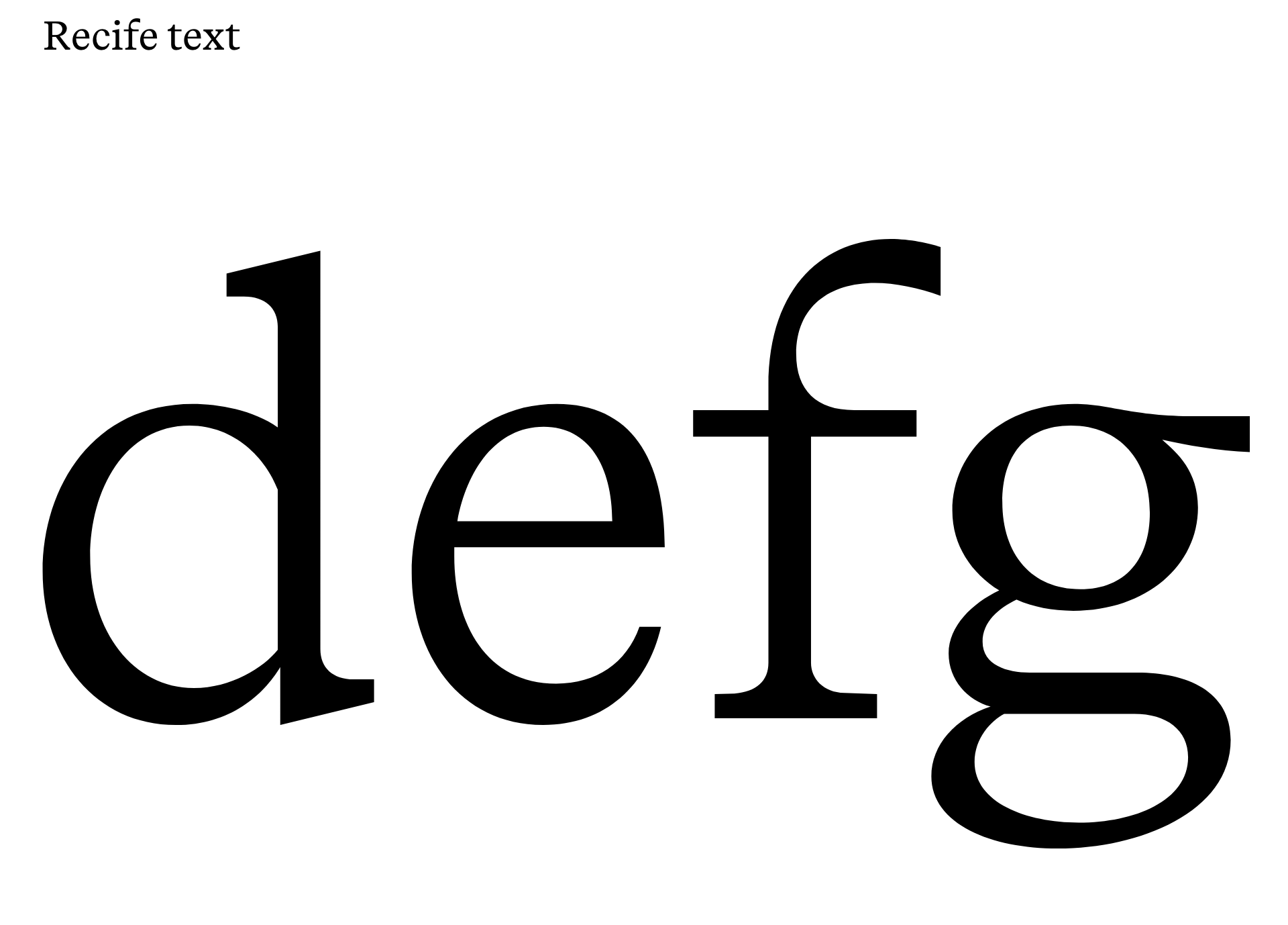
Volte use two font families. The main font is Recife text that has own crisp identity and it is used in the logo and headlines. To emphasize a specific content in headlines we use Neue Haas Unica.
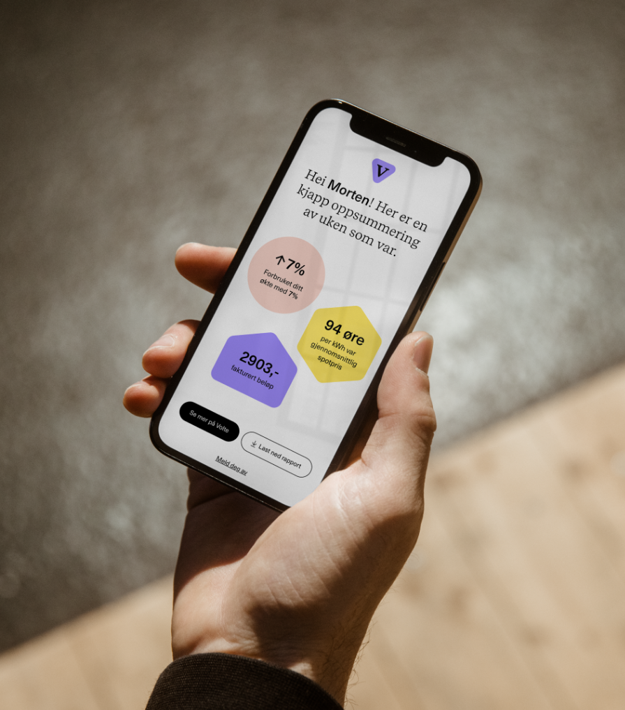
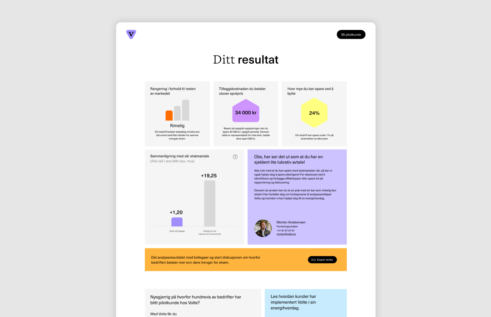
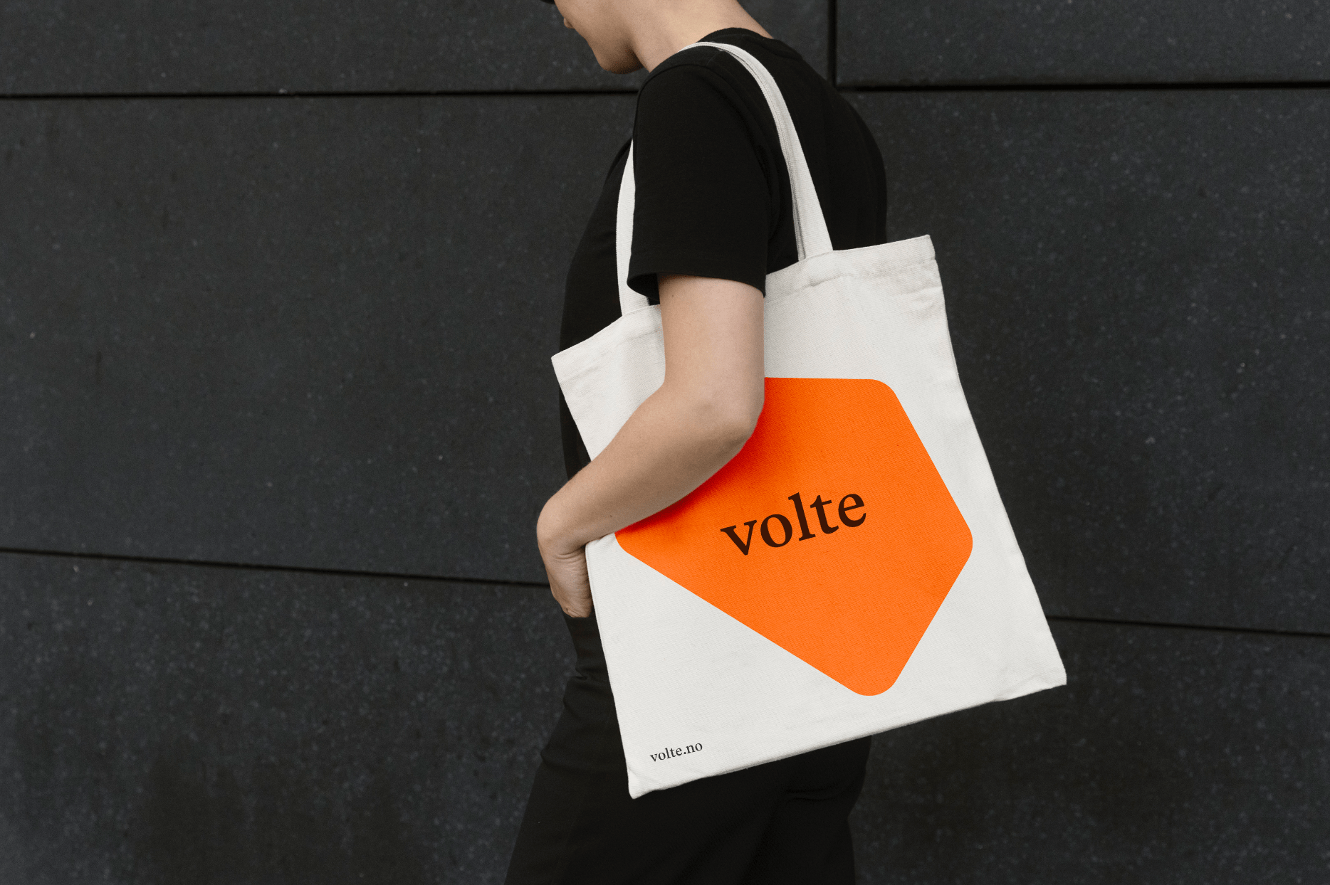
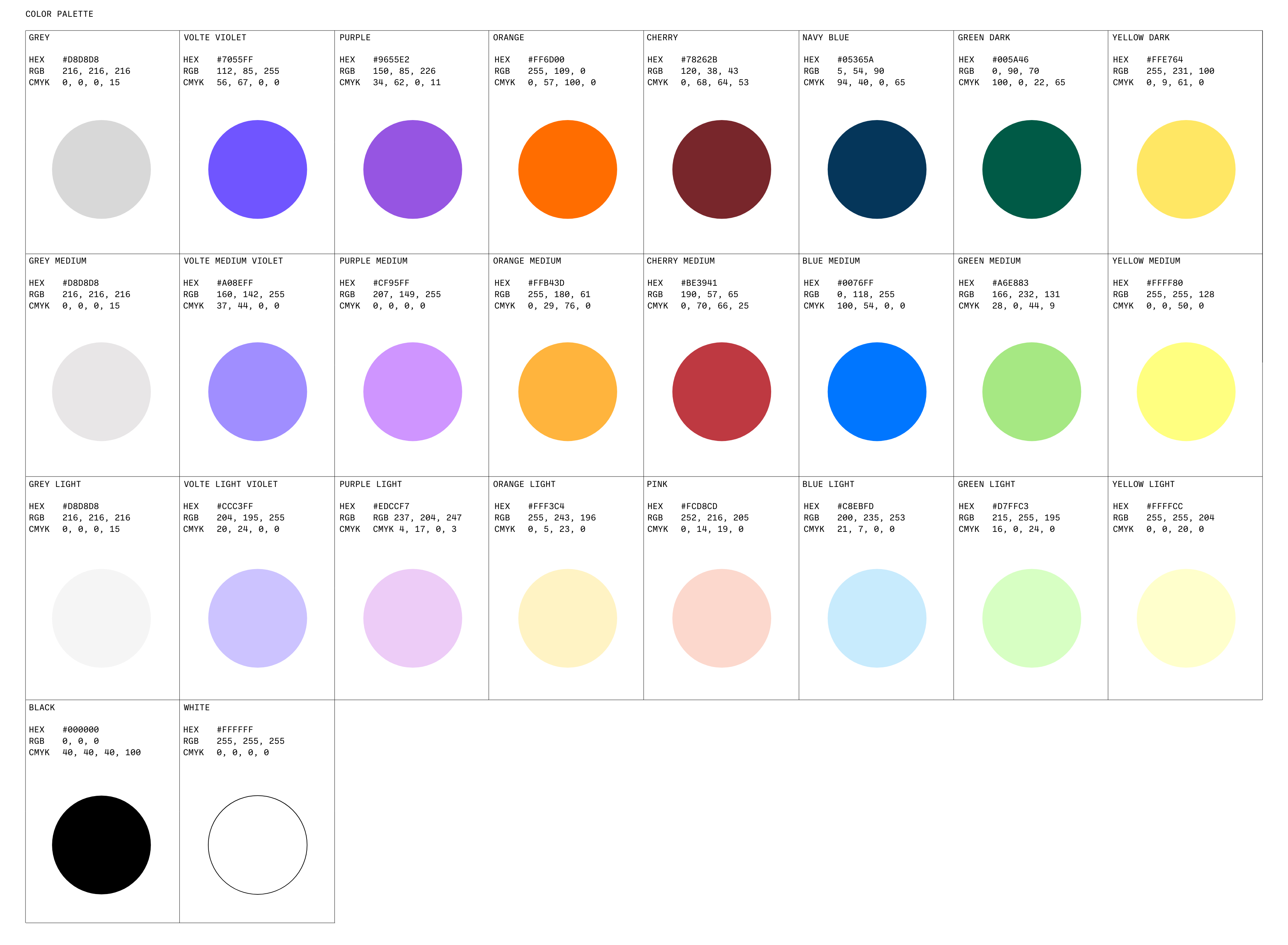
We decided to use rich colour scheme, focusing on the data, with bright colours adding a secondary and third layers to have a more flexibility to visualize one of their key services: their electricity analysis.
Layout
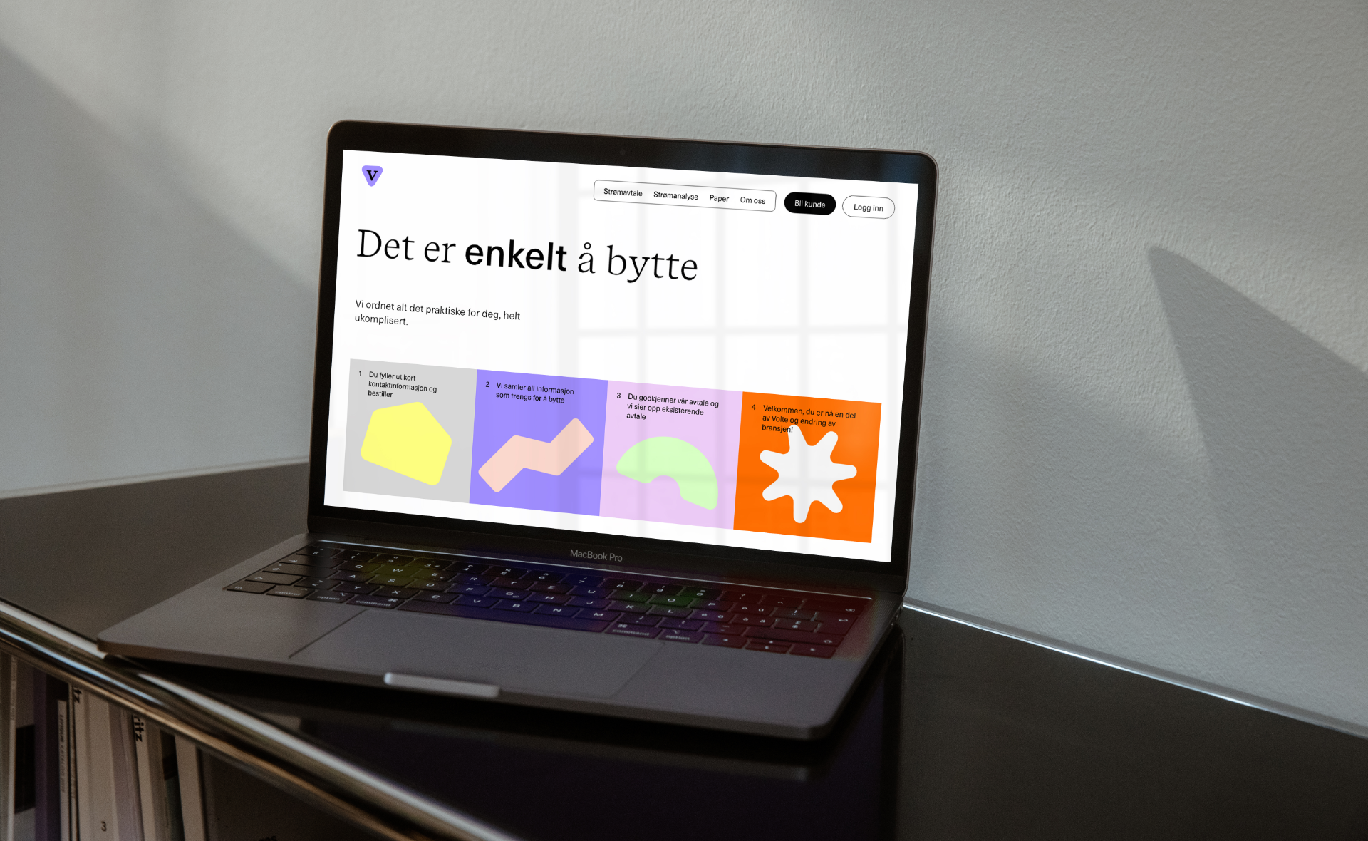
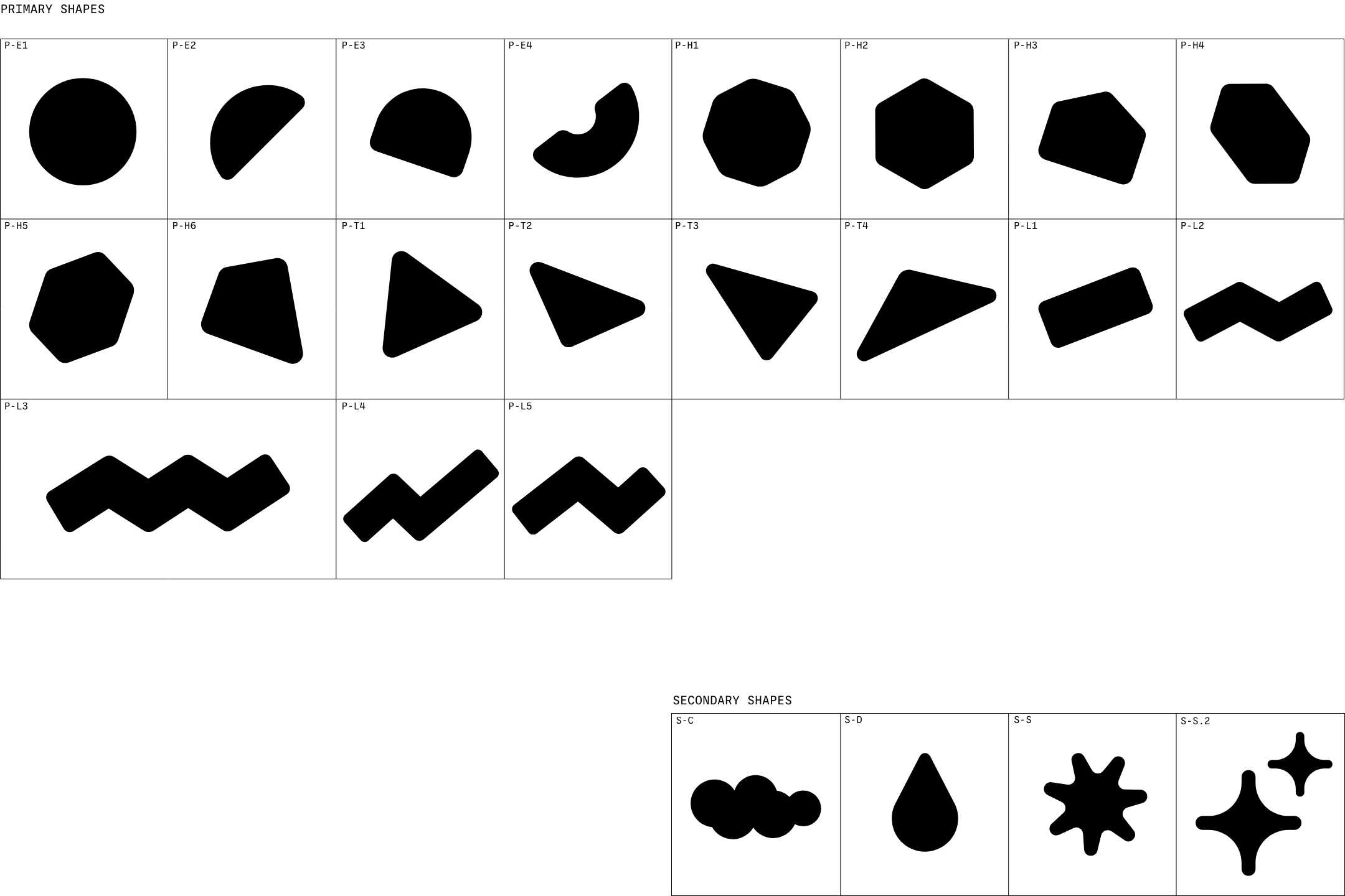
Defining a framework for the layout system, we used square and rectangle as a starting point. This simple system has plenty of possibilities in various formats and make the brand more versatile and universal.